Twelve health care platforms for Canadian practices. Turn the pages: every screen is a real screenshot of the working site.
Written up in full
A case study says who needed what, what was built, and what it was reviewed against. The rest of the folio below shows the screens. More studies are published as each practice gives written permission. See every platform on its own devices, drawn into place as you scroll.
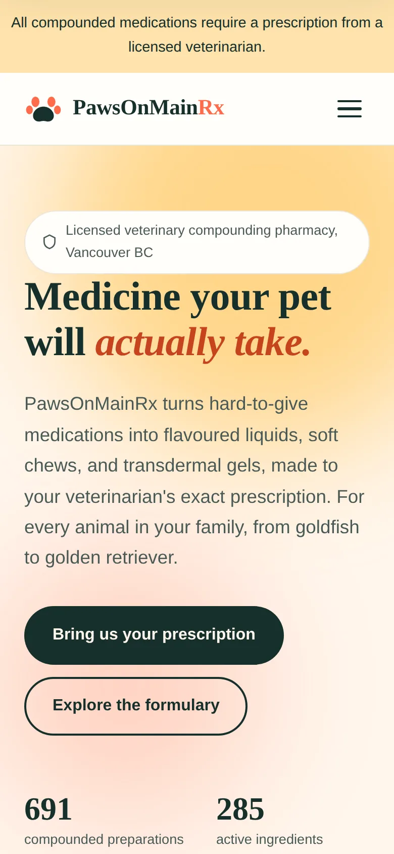
PawsOnMainRx A veterinary compounding website with a formulary of 691 compounded preparations made from 285 active ingredients, across 19 therapeutic categories and 6 animal families, browsable by animal, health concern, form and flavour.
Chapter 1
Mediglen Pharmacy and Compounding
Desktop
Laptop
Tablet
Phone
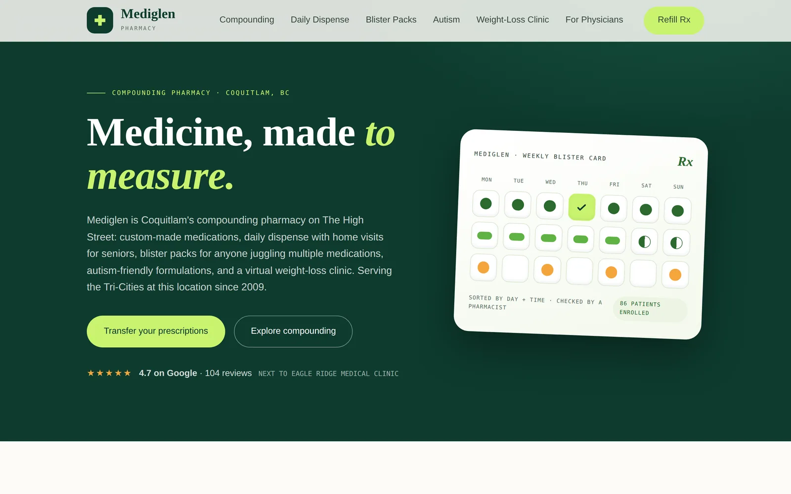
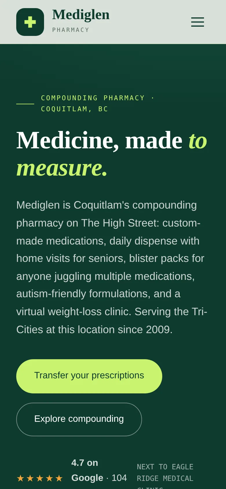
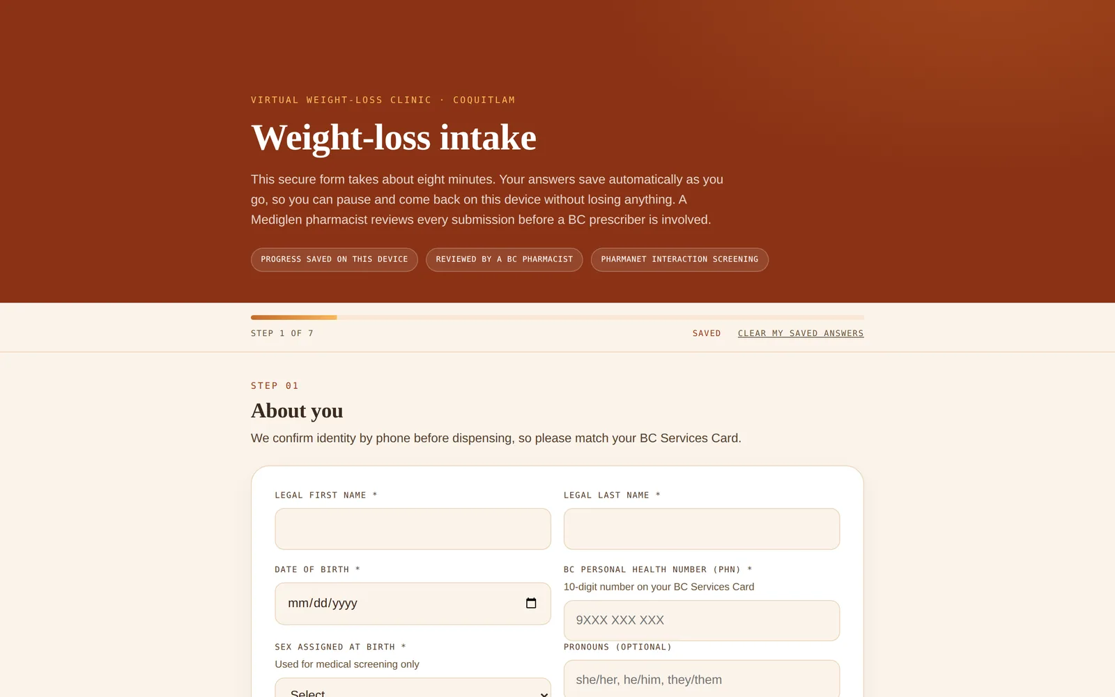
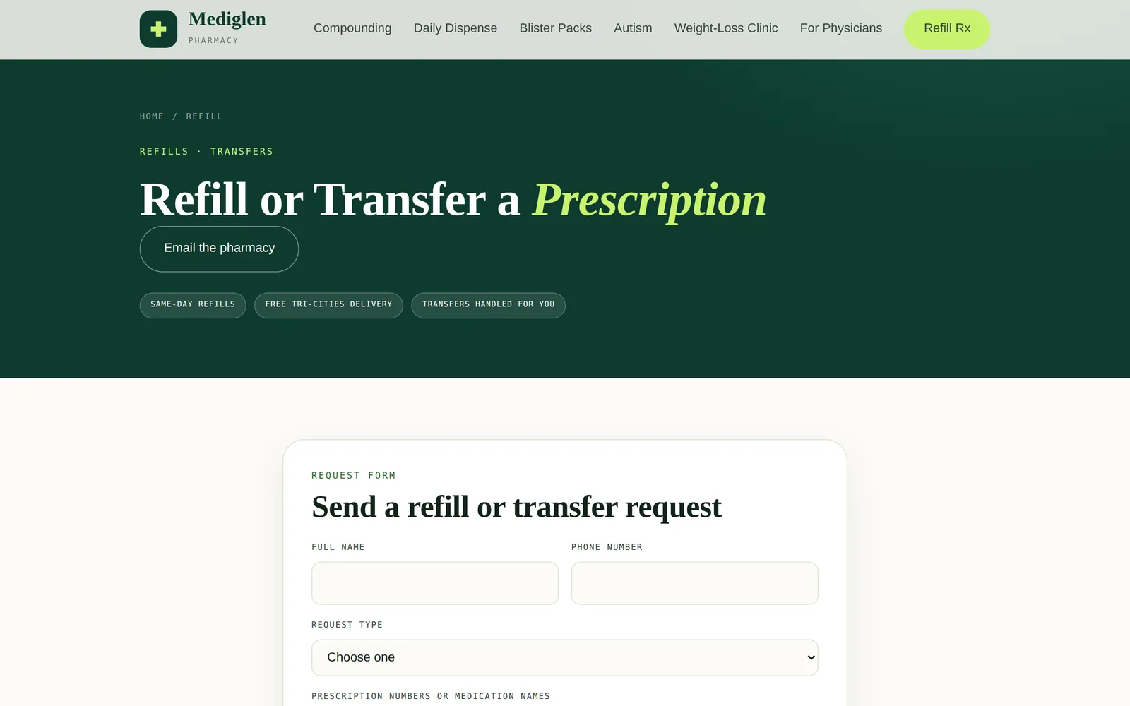
Mediglen Pharmacy and Compounding: the home page, the compounding page, the delivery page and the phone view. The hardware is drawn in code and is an illustration; only the screens are real.
Independent community pharmacy with a compounding laboratory
Coquitlam, British Columbia
Live
Live at mediglenpharmacy.com.
What the practice needed
An established pharmacy next to a medical clinic, serving seniors, their adult children, and prescribers. The previous site could be read but not used: its forms silently lost every submission.
What was built
An action oriented site where a patient can request a refill or a transfer, complete a weight management intake, and arrange free local delivery, instead of being told to telephone.
Refill and transfer requests that reach the pharmacy and are acknowledged
A seven step clinical intake that saves as you go, so nothing is lost if you stop
A summary document produced in the patient's own browser at the end of the intake
A compounding section with eight specialty areas, and a cold chain delivery service across ten cities
Pharmacist review bylines and a dated last review on the clinical pages
19 pages
41 internal links, all resolving
Independent pre launch review, July 2026
What was reviewed
Clinical pages reviewed by two pharmacists licensed in British Columbia for accuracy, current Health Canada authorization status, and consistency with College of Pharmacists of British Columbia practice standards. Last review 13 May 2026. Privacy posture reviewed against PIPEDA and BC PIPA in July 2026.
Read from the site's own stylesheet, not described from memory.
Palette
Bottle#0e3b2e
Pharmacy#2b6a2e
Leaf#5fb244
Lime#c9f36f
Apricot#f4a63c
Mist#ecf4e3
Typefaces
HeadingsCormorant Garamond
BodyOutfit
DetailIBM Plex Mono
What else defines it
A weekly blister card drawn in the interface, used as the hero rather than a photograph.
HomeMedicine, made to measure. The weekly blister card animates beside the headline.Mediglen Pharmacy and CompoundingWeight managementA distinct identity for the clinic, with eligibility and safety stated plainly.Mediglen Pharmacy and CompoundingCold chain deliveryFridge to door, with the ten cities named rather than implied.Mediglen Pharmacy and CompoundingCompoundingEight specialty areas, each with its own page.Mediglen Pharmacy and CompoundingDaily dispenseA structured programme for seniors and dementia care.Mediglen Pharmacy and CompoundingClinical intakeProgress, autosave, and a control to erase your own answers.Mediglen Pharmacy and CompoundingRefill requestA working first party form on a site whose predecessor lost every submission.Mediglen Pharmacy and CompoundingOn a phoneWhere most patients actually arrive.Mediglen Pharmacy and Compounding
Chapter 2
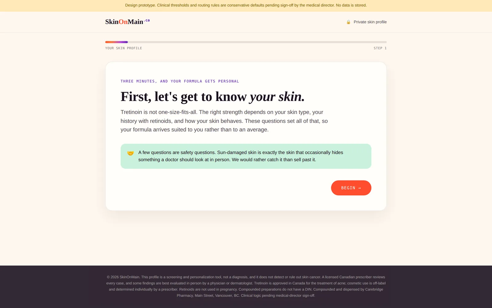
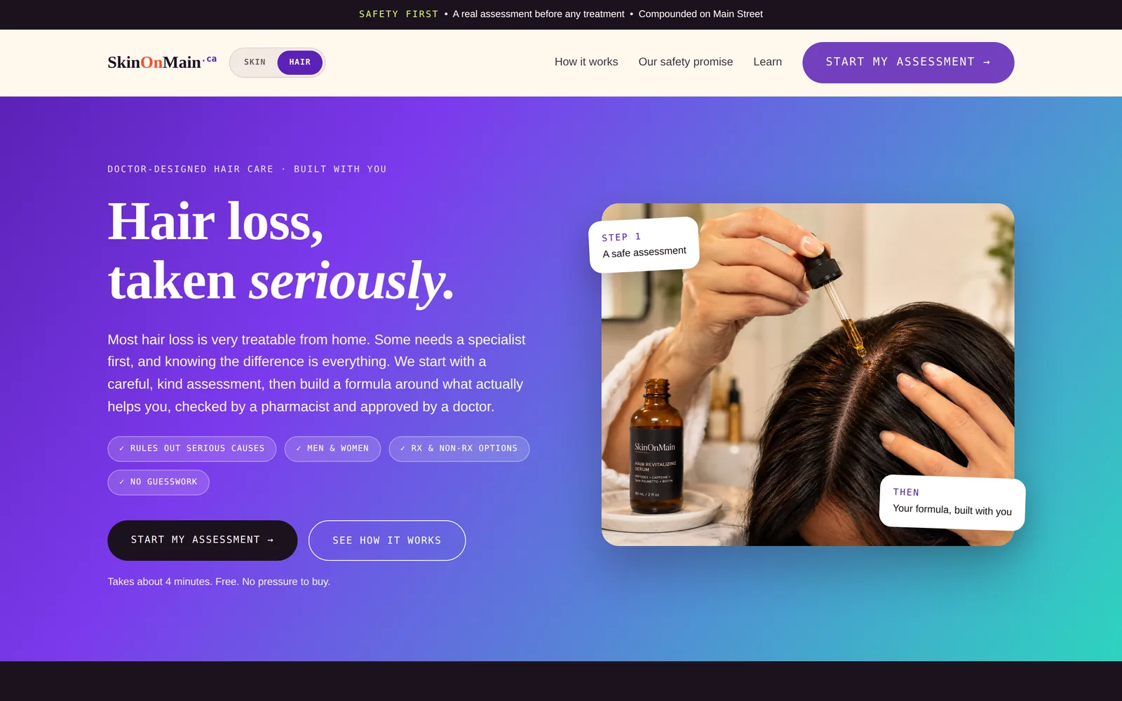
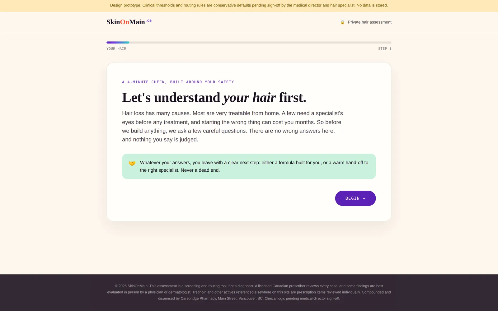
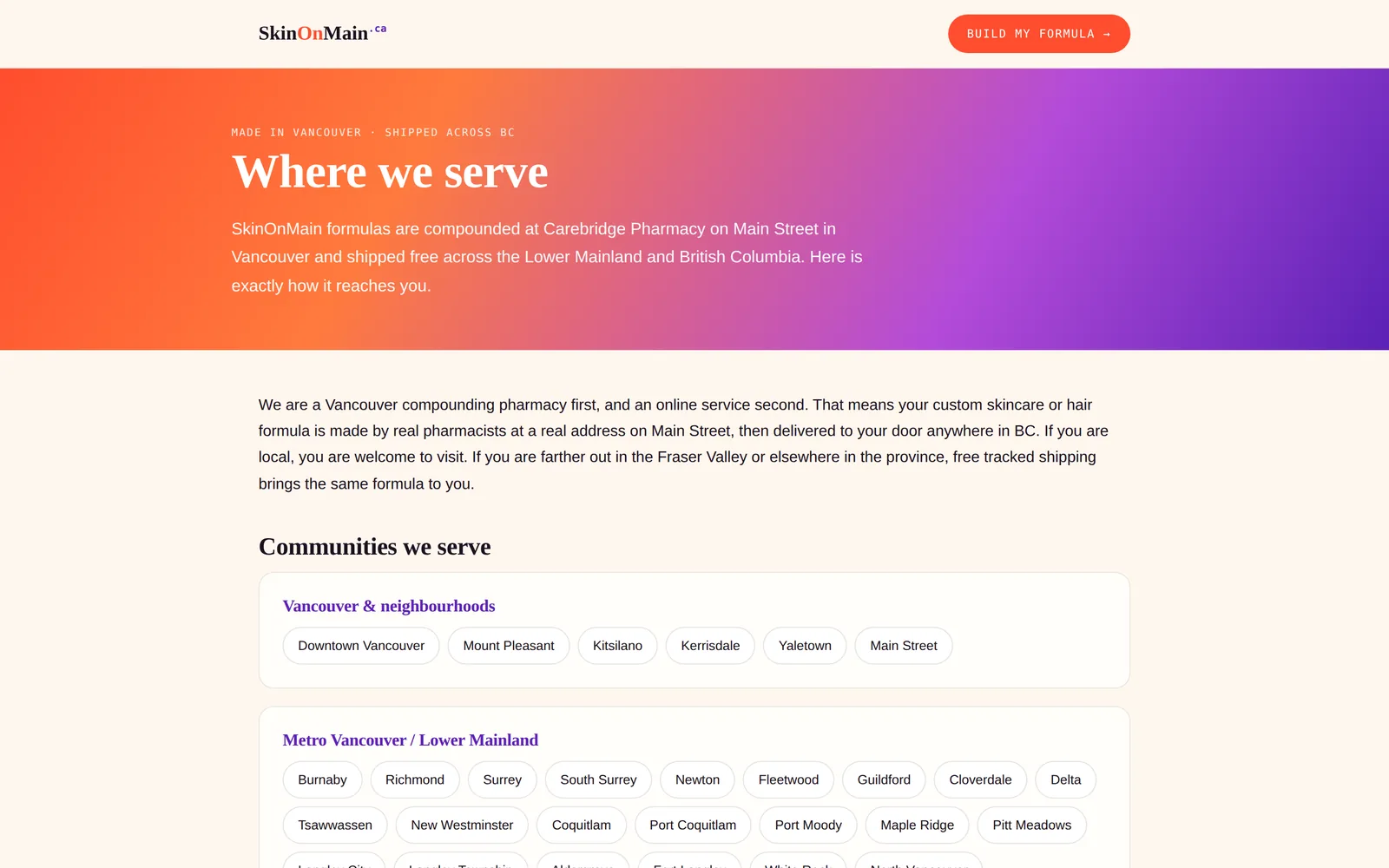
SkinOnMain
SkinOnMain across the open inner display of a folding phone. The hardware is drawn in code and is an illustration; only the screens are real.
Prescription skincare and hair programme
Vancouver, British Columbia
Built, awaiting launch
Finished and private. Launch waits on remaining sign offs.
What the practice needed
Prescription skincare is usually sold as a subscription box with the formula hidden. The brief was the opposite: let an adult build their own formula, see what each ingredient costs, and be told when a combination does not make sense.
What was built
Two formula builders, one for skin and one for hair, each screened by a safety questionnaire before anything can be built, with a pharmacist check and a prescriber decision at the end.
A questionnaire that routes to a gentler option, a prescriber flag, or an in person referral, and declines to sell when a red flag appears
Per ingredient pricing shown as the formula is assembled
Evidence grades on every active ingredient, so a weak option is labelled as one
Verified molecular structures drawn from a public chemistry database
Alerts that fire when two ingredients overlap or do not belong together
What was reviewed
Written to the College of Pharmacists of British Columbia framework for compounding, dispensing and returns, to PIPEDA and BC PIPA for privacy, and to the prescription drug advertising limits in the Food and Drug Regulations. Clinical sign off is pending and every clinical page says so.
Read from the site's own stylesheet, not described from memory.
Palette
Coral#ff4d2e
Violet#5b21b6
Lime#d9f962
Mint#c9f2dc
Peach#ffd9c4
Ink#1c1220
Typefaces
HeadingsFraunces
BodySpace Grotesk
DetailSpace Mono
What else defines it
Molecular structures drawn as line art, one per active ingredient, used in the formula builder.
HomeBuilt by you, checked by a pharmacist. The formula assembles as you read.SkinOnMainSkin profileThe screening step, which can end in a referral rather than a sale.SkinOnMainSkin formula barA live label, a locked sun protection line, and alerts that change as ingredients are added.SkinOnMainHairThe second programme, sharing the same engine and the same restraint.SkinOnMainHair assessmentFour routes out, including one that sends you to a doctor.SkinOnMainHair formula barEvidence grades, a stack score, and the molecular structure of each active.SkinOnMainWhere it reachesStated plainly, with no claim to serve places it does not.SkinOnMainOn a phoneThe builder works the same way under a thumb.SkinOnMain
Chapter 3
Carebridge Pharmacy
Display
Laptop
Phone
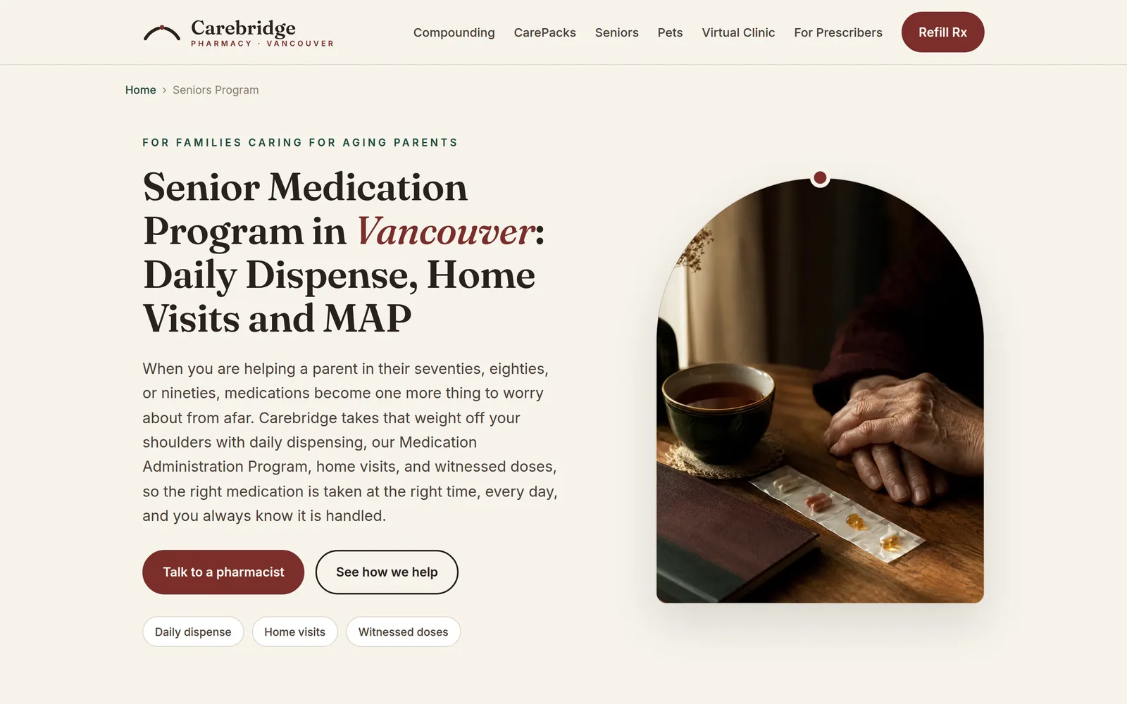
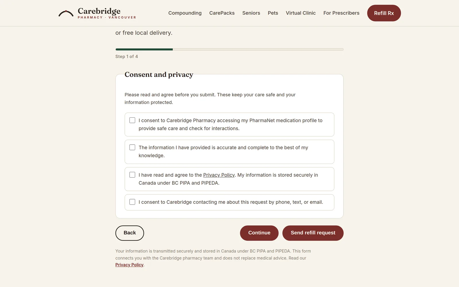
Carebridge Pharmacy: the home page on a studio display, the seniors page on a laptop, and the phone view. The hardware is drawn in code and is an illustration; only the screens are real.
Independent community pharmacy
Vancouver, British Columbia
Built, awaiting launch
A finished build of 68 pages, waiting for the practice to open under this name.
What the practice needed
A pharmacy that does compounding, multi dose packaging, seniors care, delivery and a set of virtual clinics needed all of it to be findable, and needed a patient, a caregiver or a prescriber to be able to start the right request without telephoning.
What was built
Sixty eight pages organised so that every service has a real entry point, from a refill to a compounded preparation to an enrolment in a packaging programme.
Eight request paths, each going to the people who can act on it
A compounding section with a forms table and eight specialty pages
A seniors programme presented as a comparison a family can act on
Twenty neighbourhood delivery pages and eleven city pages
Care consent and marketing consent kept as separate choices, never bundled
68 pages
212 structured data blocks, all valid
Zero broken links at the last full check
What was reviewed
Prescription drug pages written to section C.01.044 of the Food and Drug Regulations, which limits what may be said to name, price and quantity. Licensure and pharmacist identification applied per College of Pharmacists of British Columbia guidance. Privacy policy written against PIPEDA and BC PIPA. Counsel review is outstanding and is required before launch.
The design
Carebridge Pharmacy
Read from the site's own stylesheet, not described from memory.
Palette
Oxblood#7a2e2a
Bottle#1f4a38
Amber#d9a05b
Paper#f7f3ec
Ink#2a211c
Typefaces
HeadingsFraunces
BodyInter
What else defines it
An apothecary palette: warm paper, a single oxblood, and a bottle green kept for clinical notes.
HomeThe pharmacy between your doctor and your door.Carebridge PharmacyCompoundingThe densest page on the site, made scannable.Carebridge PharmacyPaediatric compoundingIt says compounding makes a medicine easier to take, and does not treat the condition. That distinction is the whole page.Carebridge PharmacySeniors programmeService tiers a caregiver can compare in one look.Carebridge PharmacyConsentFour separate agreements, each one a deliberate choice.Carebridge PharmacyVirtual clinicsEight programmes, each themed to where it leads.Carebridge PharmacyOn a phoneSixty eight pages, still navigable with a thumb.Carebridge Pharmacy
Chapter 4
Vytals
Home
Test catalogue
Patient portal
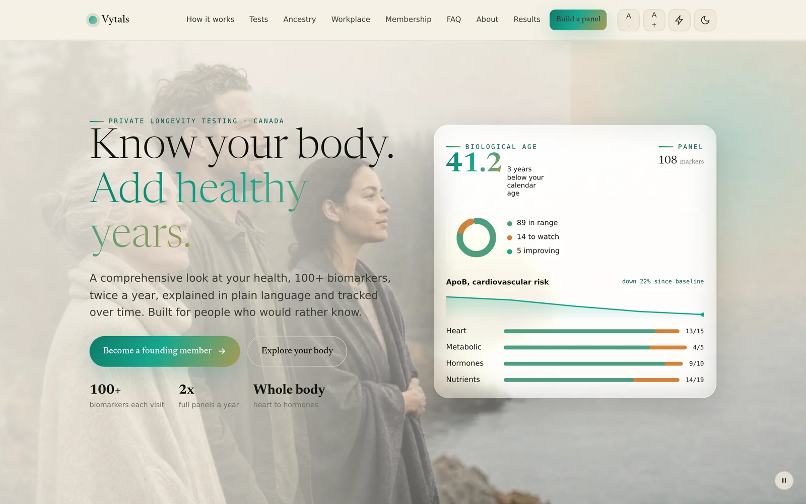
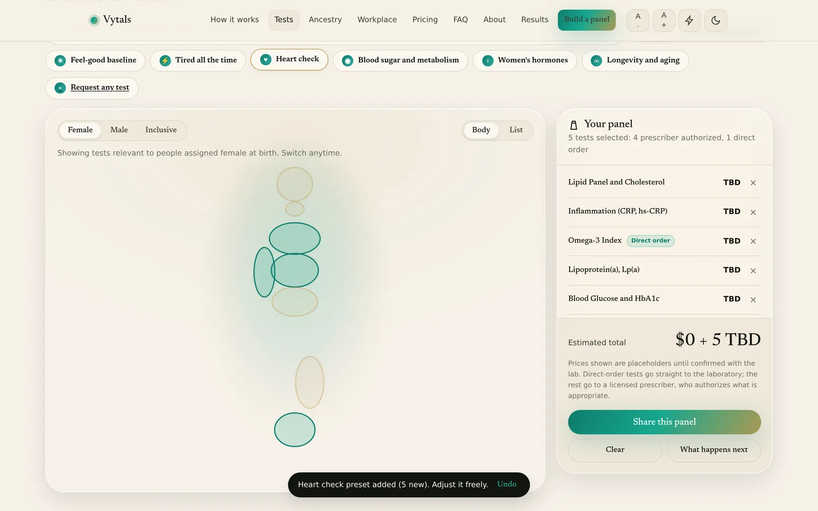
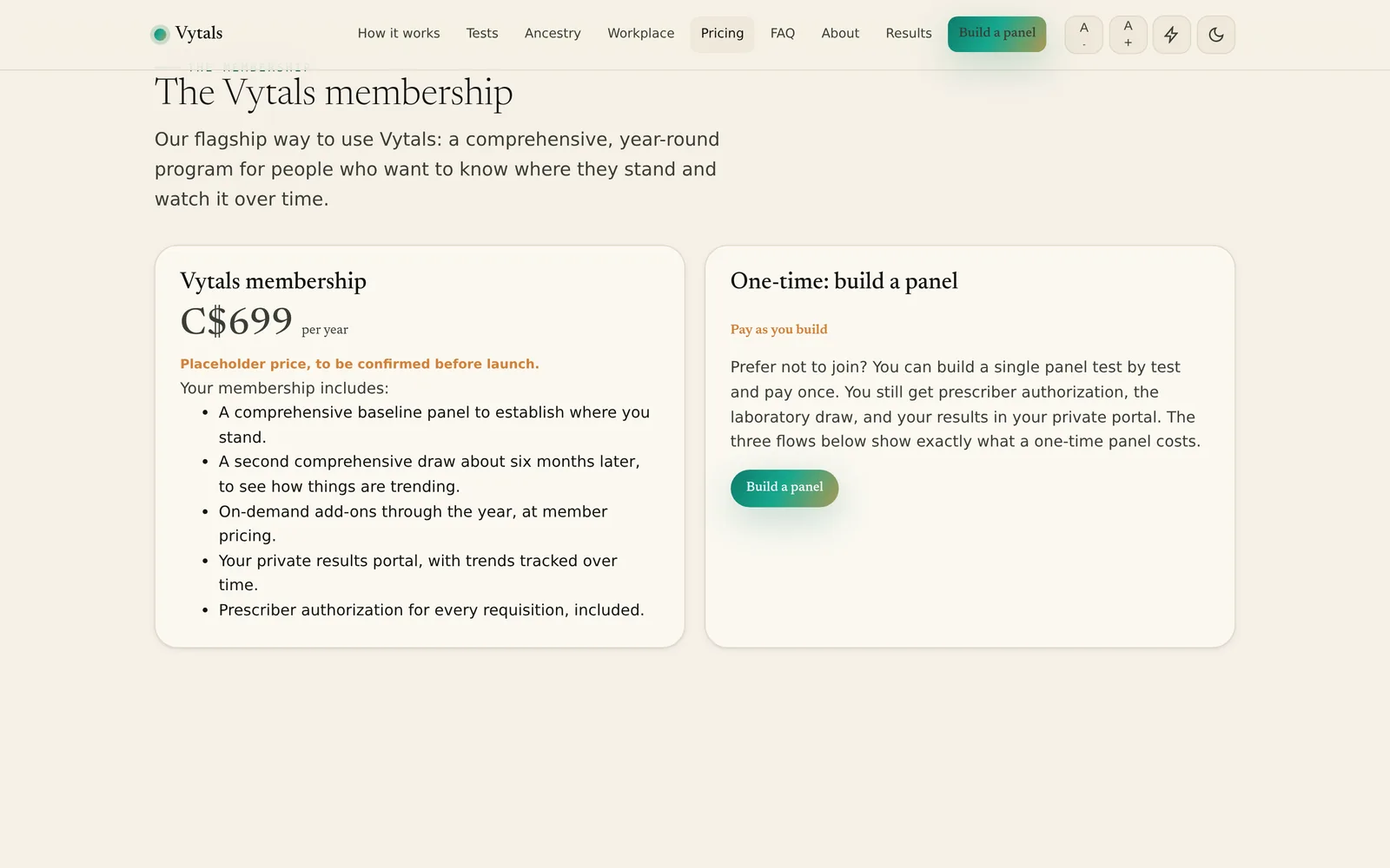
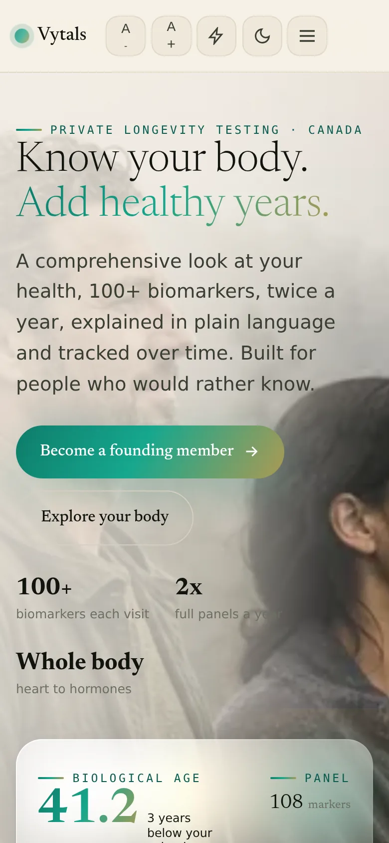
Vytals across three displays: the home page, the test catalogue and the patient portal. The hardware is drawn in code and is an illustration; only the screens are real.
Preventive laboratory testing platform
Vancouver, British Columbia
Live
The website is live. The service itself is pre launch, and the site says so on every relevant page.
What the practice needed
Private laboratory testing is sold either as a mystery panel or as a wall of test names. The brief was to make a catalogue explorable by a person who is curious but not clinical, without implying that any of it replaces a doctor.
What was built
A catalogue of 68 tests across 15 categories, explored through the body, through a line of work, or through ancestry, with a panel builder that shows what a selection would cost.
An interactive body explorer with reference profiles
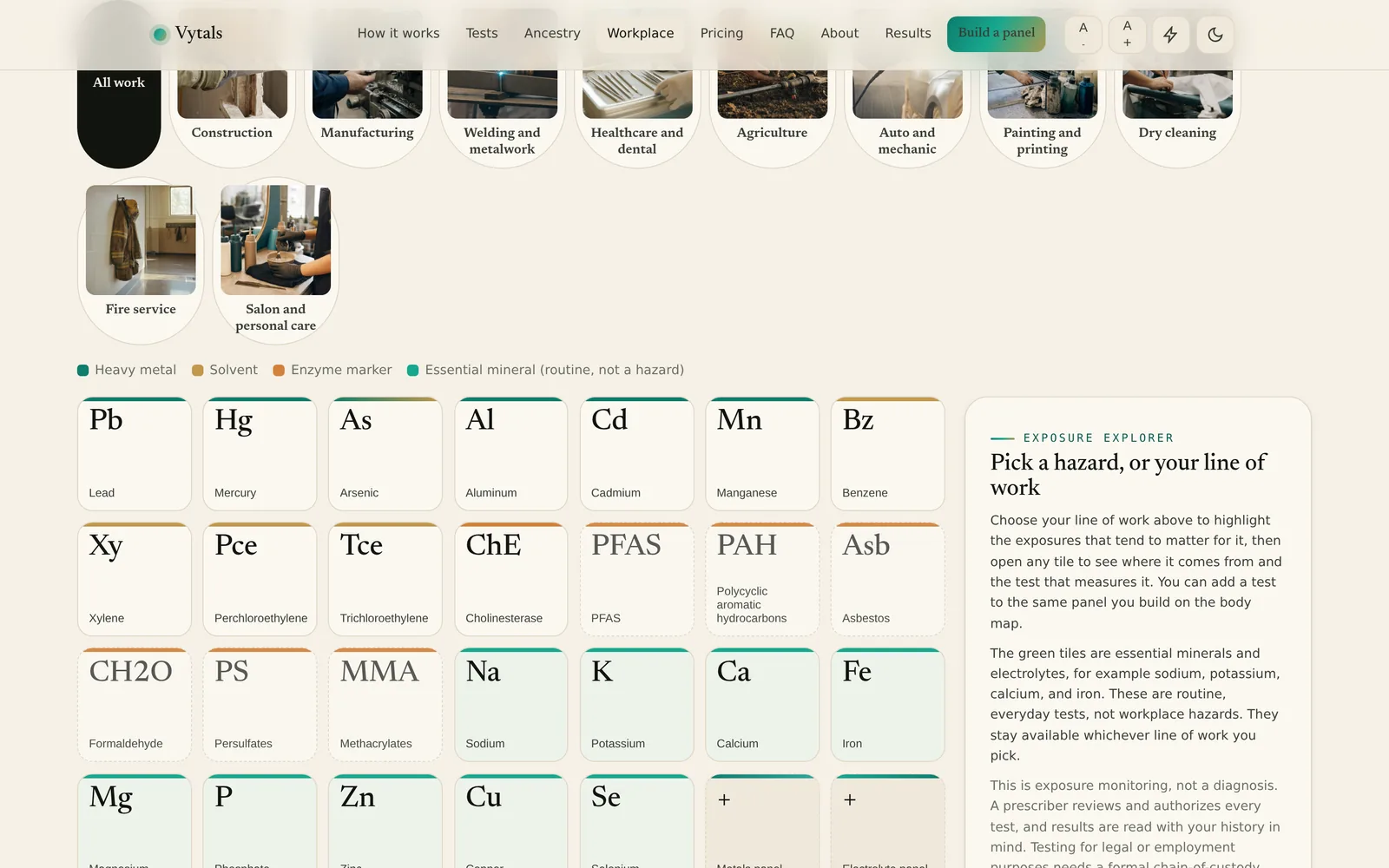
An occupational view that maps a trade to the exposures associated with it
A deliberate distinction between a test that exists and an exposure with no validated marker
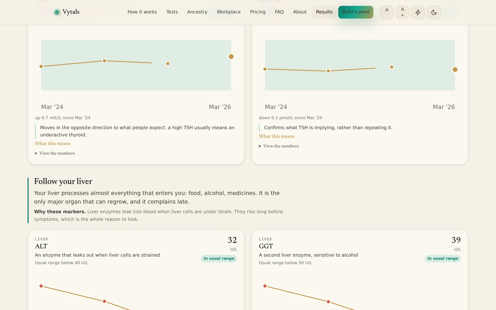
A results view that explains a number in plain language and tracks it over time
Clear labelling of every illustrative figure, including the sample dashboard and the placeholder prices
68 tests across 15 categories
Page speed 83 on mobile and 99 on desktop, one laboratory measurement on 5 September 2026
What was reviewed
Occupational and ancestry content built on an internal evidence discipline: named monograph sources cited for specific exposures, groups kept distinct rather than merged, and no exposure limits reproduced. Last internal review 6 September 2026. Regulatory counsel review has not taken place and the site does not claim otherwise.
Read from the site's own stylesheet, not described from memory.
Palette
Plasma#0e7c6b
Oxygen#16a78e
Gold#c2984b
Paper#f5f0e7
Ink#12140f
Typefaces
HeadingsNewsreader
BodyInter
DetailIBM Plex Mono
What else defines it
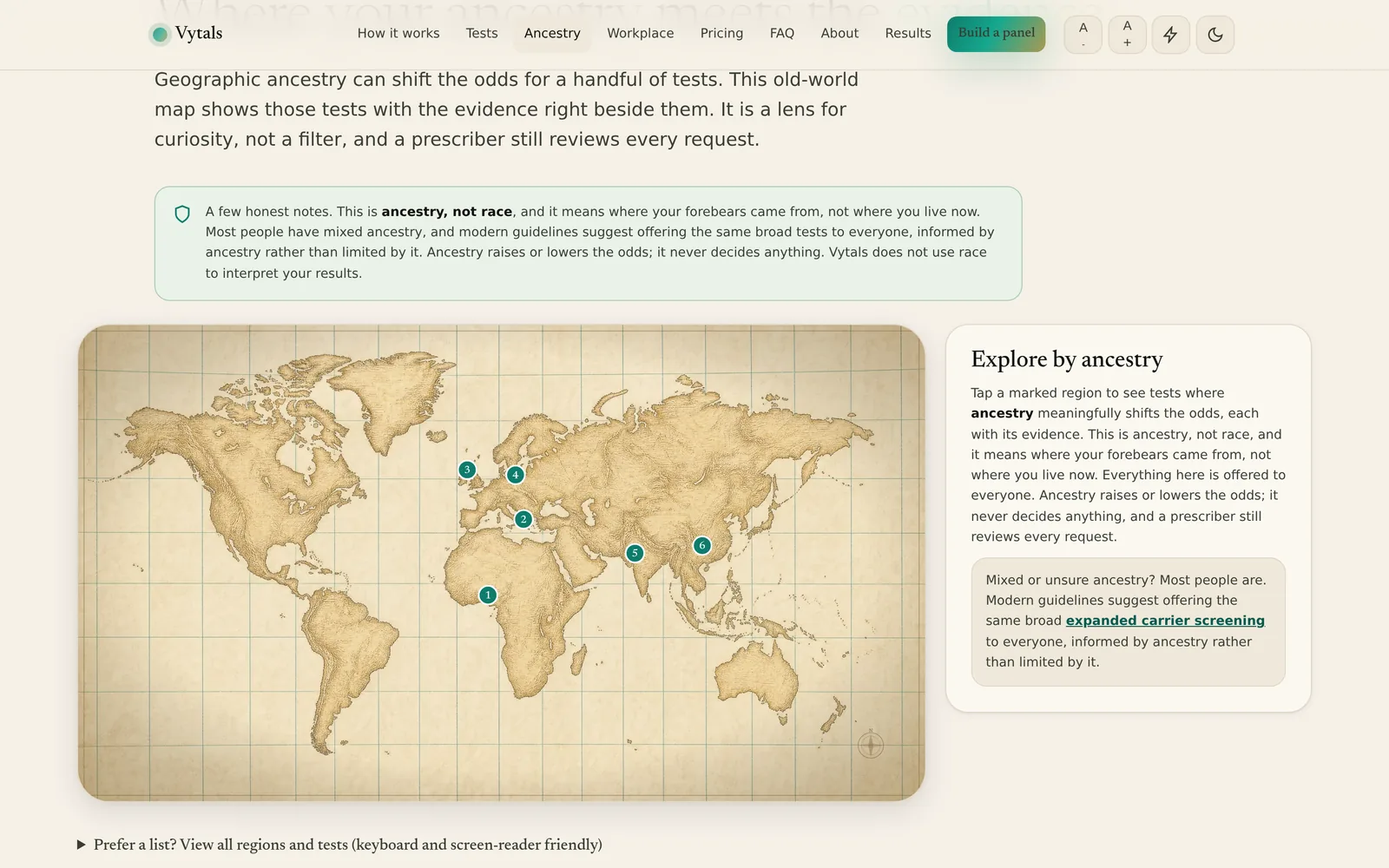
An interactive body drawn in the page, and an old world map used to explore by ancestry.
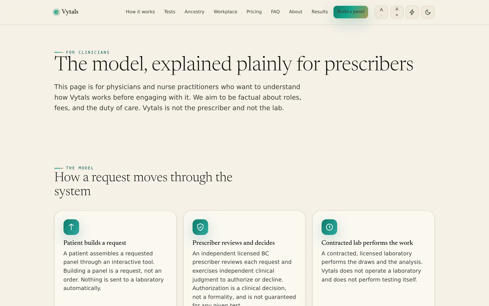
HomeA sample results dashboard, labelled as illustrative rather than passed off as a record.VytalsThe cataloguePick a preset or touch an organ, and the panel assembles itself. Every price is marked to be confirmed.VytalsBy occupationWhat a line of work exposes you to, and where no reliable test exists.VytalsBy ancestryRegions mapped to the tests that have a reason behind them.VytalsResultsA biomarker explained, and the same marker over time.VytalsFor cliniciansThe authorisation model, which is what makes the service lawful in Canada.VytalsMembershipEvery price on the page is marked as a placeholder, because it is.VytalsOn a phoneThe dashboard reflows rather than shrinking.Vytals
Chapter 5
quitOH
Laptop
Tablet
Phone
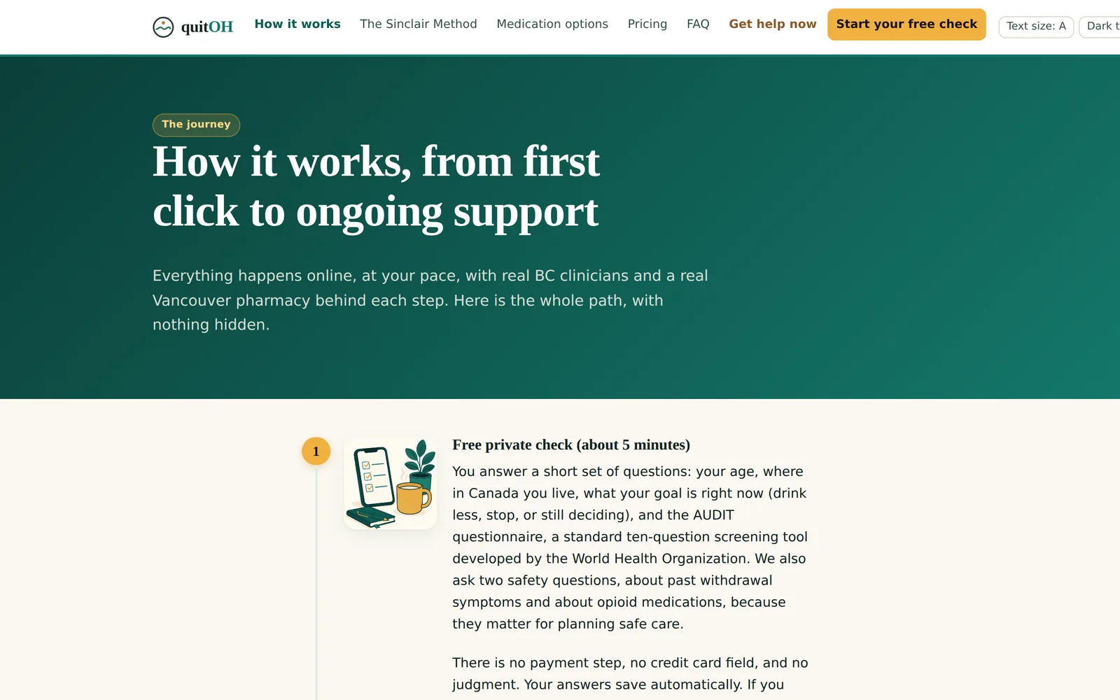
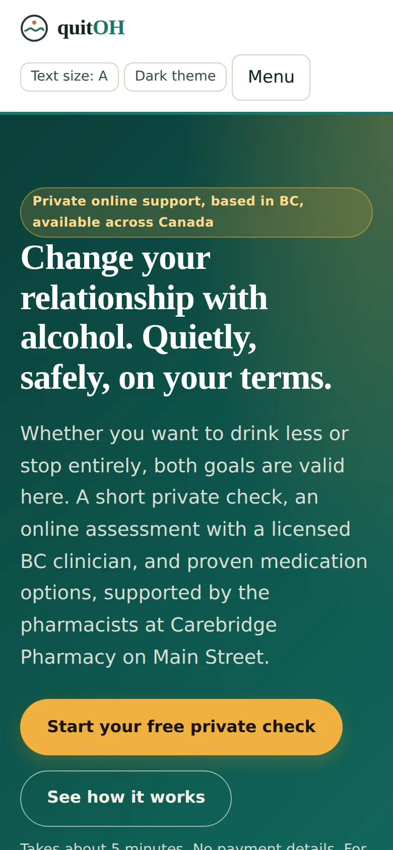
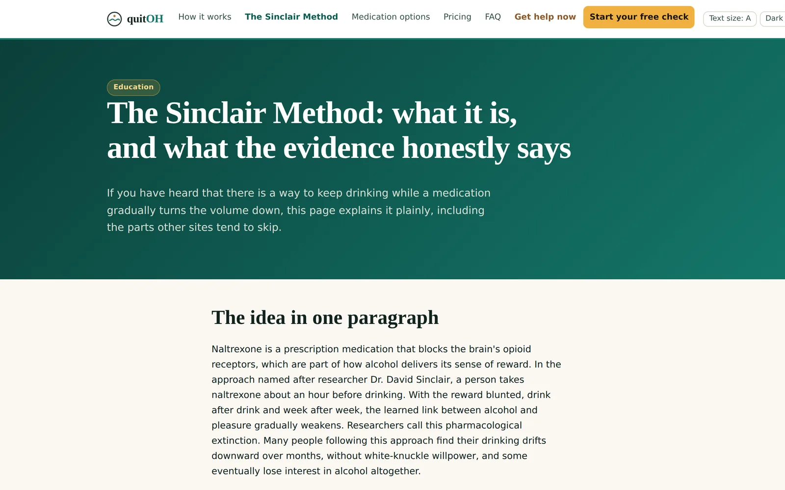
quitOH: the home page on a laptop, how it works on a tablet, and the phone view. The hardware is drawn in code and is an illustration; only the screens are real.
Alcohol support programme
British Columbia
Built, awaiting launch
Built and briefly live. Currently behind a holding page while the programme waits to open.
What the practice needed
Most people who wonder about their drinking never ask anyone. The brief was to make the first step private, free, and impossible to feel judged by, and to route the small number of people in danger to help immediately.
What was built
A screening and intake pathway that treats drinking less and stopping as equally valid goals, with safety gates that interrupt the flow when the answers call for it.
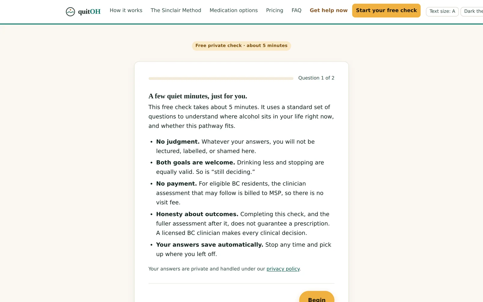
A recognised screening questionnaire, one question at a time, saving as you go
A withdrawal safety gate that stops and redirects to urgent care when needed
A self harm question answered with crisis guidance rather than a form field
Crisis lines present in the footer of every page, not buried on a contact page
An evidence page that states plainly what is well supported and what is not
What was reviewed
Content written against the 2023 Canadian guideline for high risk drinking and alcohol use disorder, the WHO screening instrument, Health Canada limits on prescription drug advertising to the public, and College advertising norms for pharmacists and physicians. Clinical reviewers are named on the site.
Read from the site's own stylesheet, not described from memory.
Palette
Brand#14776a
Deep#0b3f39
Bright#23a58f
Gold#f0b13f
Cream#fbf8f2
Ink#12231f
Typefaces
HeadingsIowan Old Style and the system serif stack
Bodythe system sans stack
What else defines it
No webfonts at all: the system stacks, so the first paint carries no network cost.
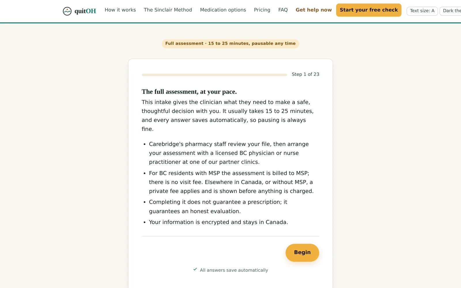
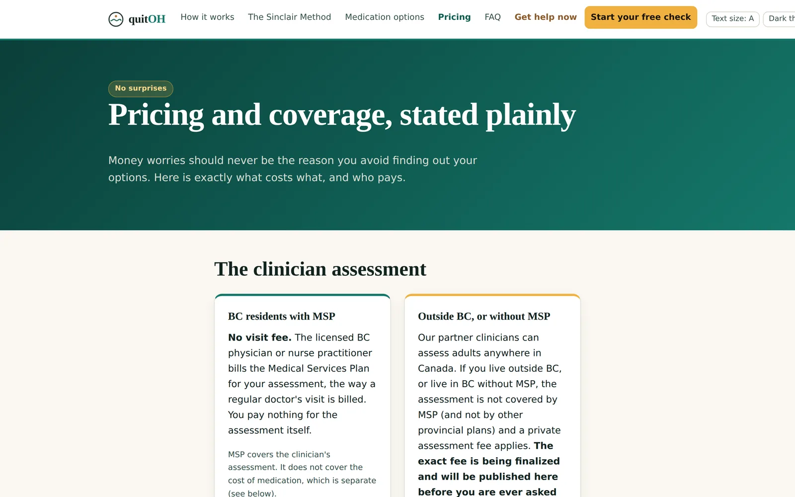
HomeCalm, unhurried, with the fee stated under the buttons rather than discovered later.quitOHHow it worksWho does what, with the clinic and the pharmacy kept visibly separate.quitOHThe evidenceWhat is well supported, set beside what is less certain.quitOHThe free checkNo judgment, both goals welcome, and no promise of a prescription.quitOHFull intakeEleven short sections, with a medication step that accepts a photograph of the label.quitOHCost and coverageIncluding a list of what the programme will never do.quitOHOn a phoneWhere a private question is most likely to be asked.quitOH
Chapter 6
NovaMed Pharmacy
Display
Notebook
Tablet
Phone
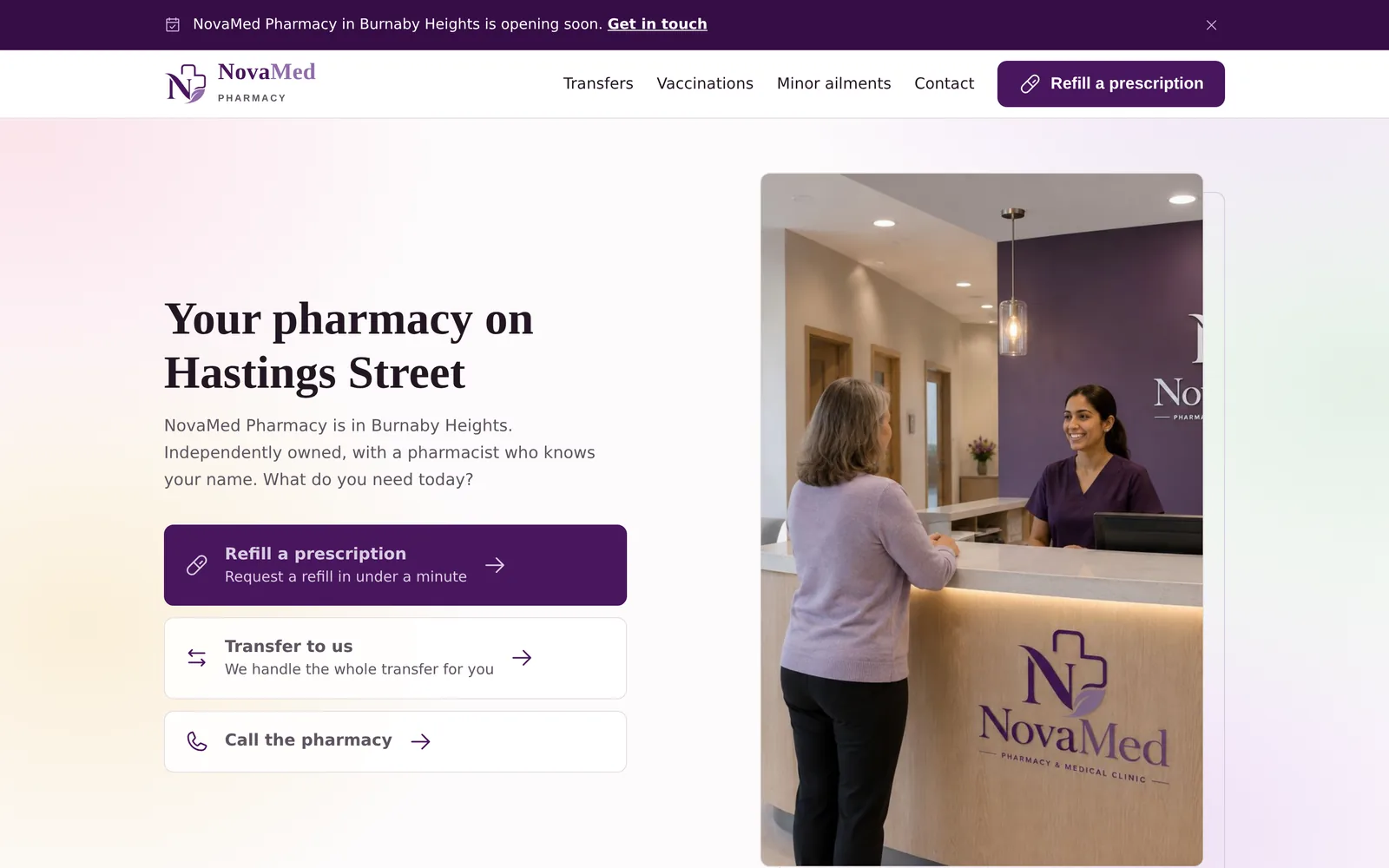
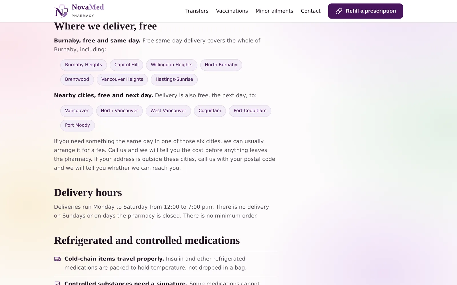
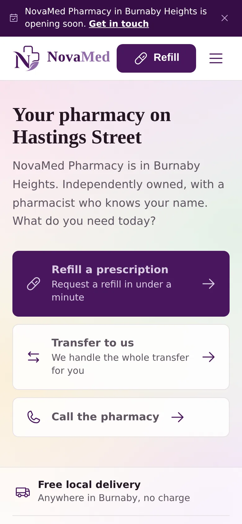
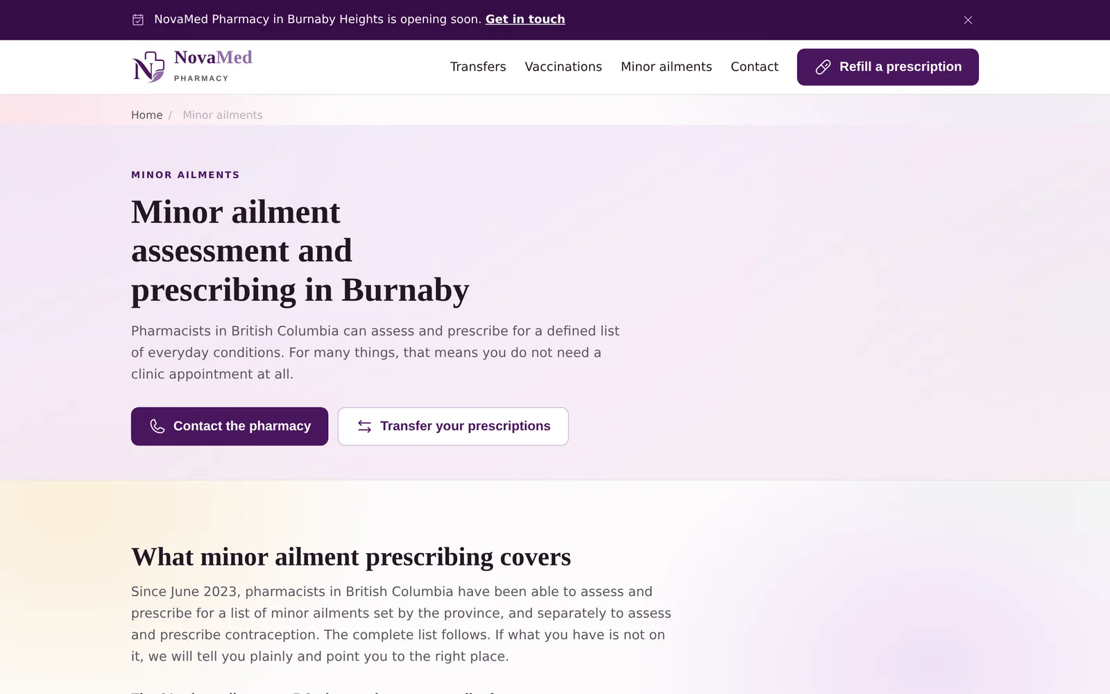
NovaMed Pharmacy: the home page, the delivery page, the packaging page and the phone view. The hardware is drawn in code and is an illustration; only the screens are real.
Independent community pharmacy
Burnaby, British Columbia
Live
Live at novamedpharmacy.ca.
What the practice needed
A new pharmacy opening beside a medical clinic, sharing a front door with it but not a legal entity. It needed a presence that stood on its own, in English and Farsi, and that never read as a department of the clinic next door.
What was built
Twelve pages that explain what the pharmacy does before it opens, with every service described in the language a patient would use to ask for it.
Bilingual presentation in English and Farsi
A three tier delivery service set out as a table, mirrored exactly in the underlying structured data
Minor ailment prescribing explained against the provincial list, rather than implied
Compliance packaging written for the family member who arranges it, not for the pharmacist
Request forms that state plainly that they are not live yet, rather than quietly failing
12 pages
Built in parallel with the clinic site, roughly five weeks for the pair
One H1 per page, and no horizontal overflow at 1440, 720 or 390 pixels
What was reviewed
Content reviewed on 9 September 2026 in an independent website audit against College of Pharmacists of British Columbia guidance for pharmacy content and the provincial PharmaCare minor ailments policy, alongside the practice's own pharmacy regulatory review dated 7 August 2026. The audit identified items to correct; it is not a clearance, and the legal review of the privacy and terms pages is still outstanding.
Read from the site's own stylesheet, not described from memory.
Palette
Brand#49165e
Deep#360d46
Cream#f6f1e7
Ink#241623
Line#e6dfe2
Typefaces
HeadingsCormorant Garamond
BodyInter
FarsiVazirmatn
What else defines it
A third typeface carries the Farsi, so both languages are set properly rather than one being forced through the other.
HomeAn opening notice, a bilingual welcome, and the services as cards.NovaMed PharmacyDeliveryThree tiers, with the same facts in the page and in its structured data.NovaMed PharmacyCompliance packagingExplained for the family member who arranges it, not the pharmacist.NovaMed PharmacyMinor ailmentsWhat a pharmacist in this province may assess and prescribe for, set out against the list.NovaMed PharmacyOn a phoneWhere most patients will arrive.NovaMed Pharmacy
Chapter 7
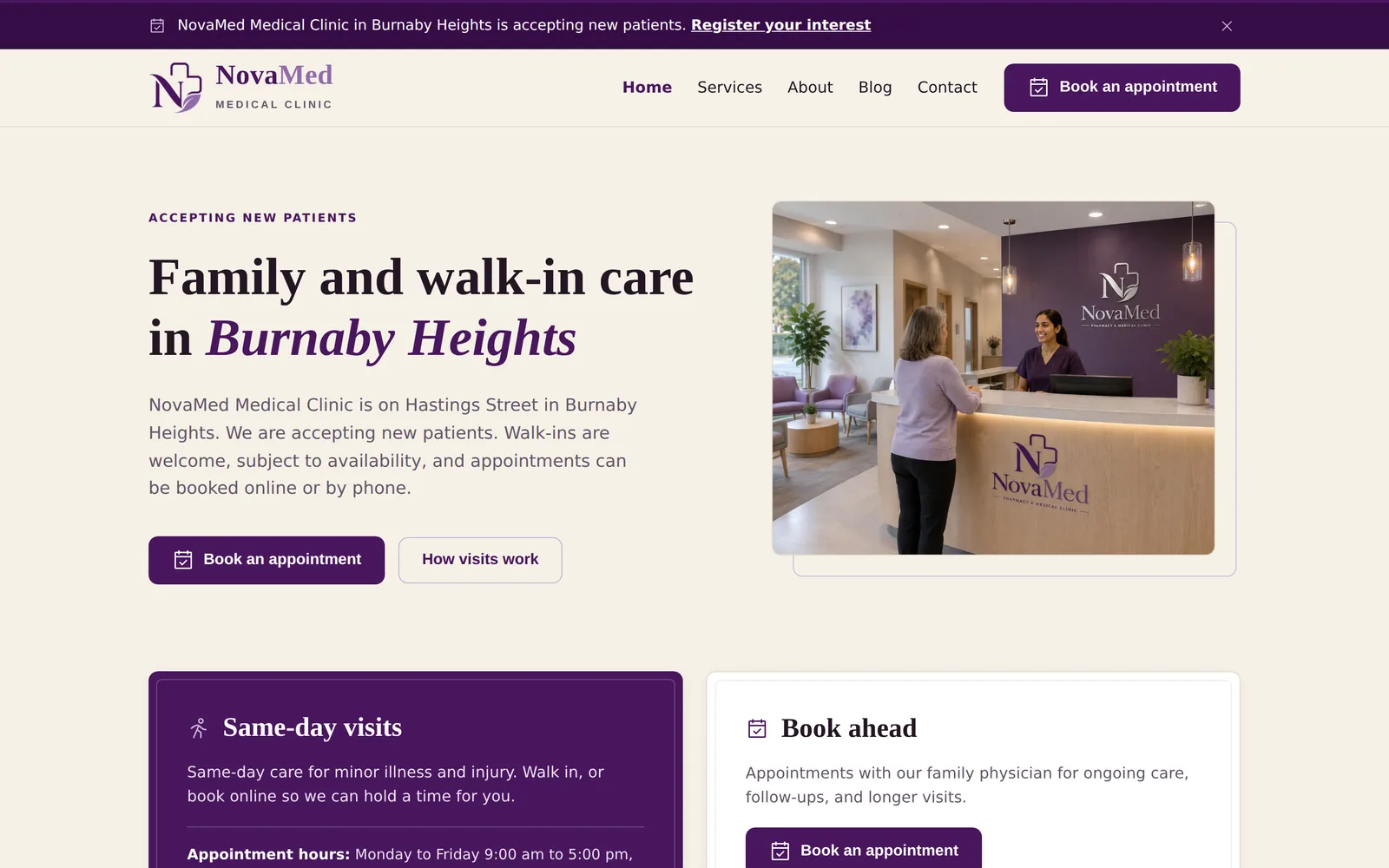
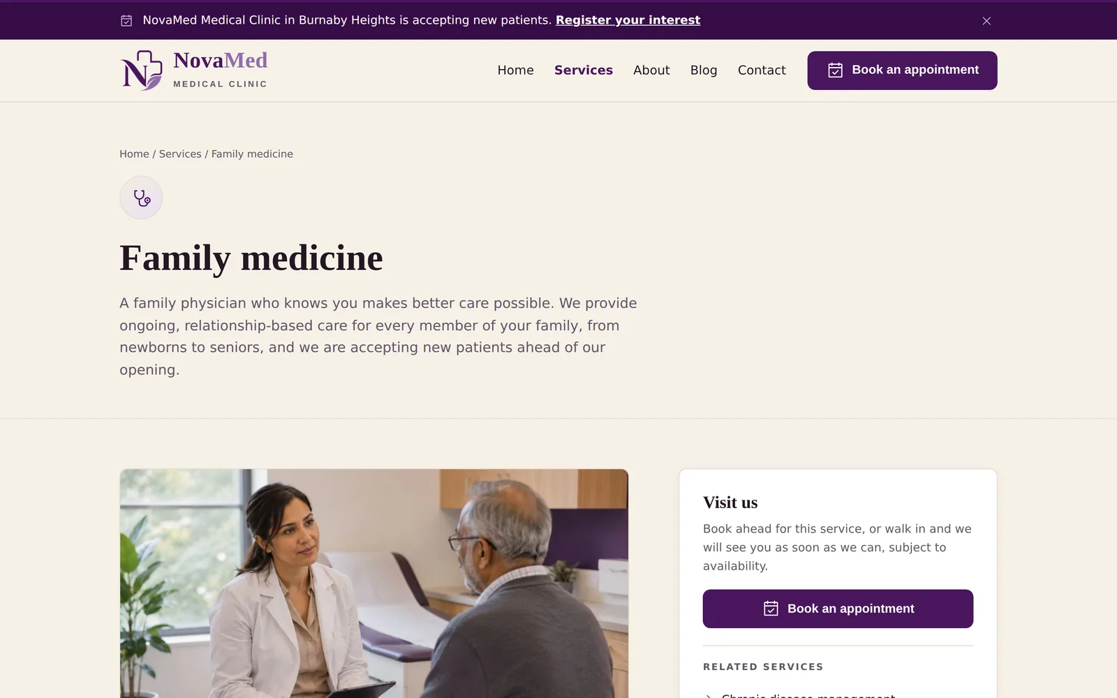
NovaMed Medical Clinic
Notebook
Tablet
Phone
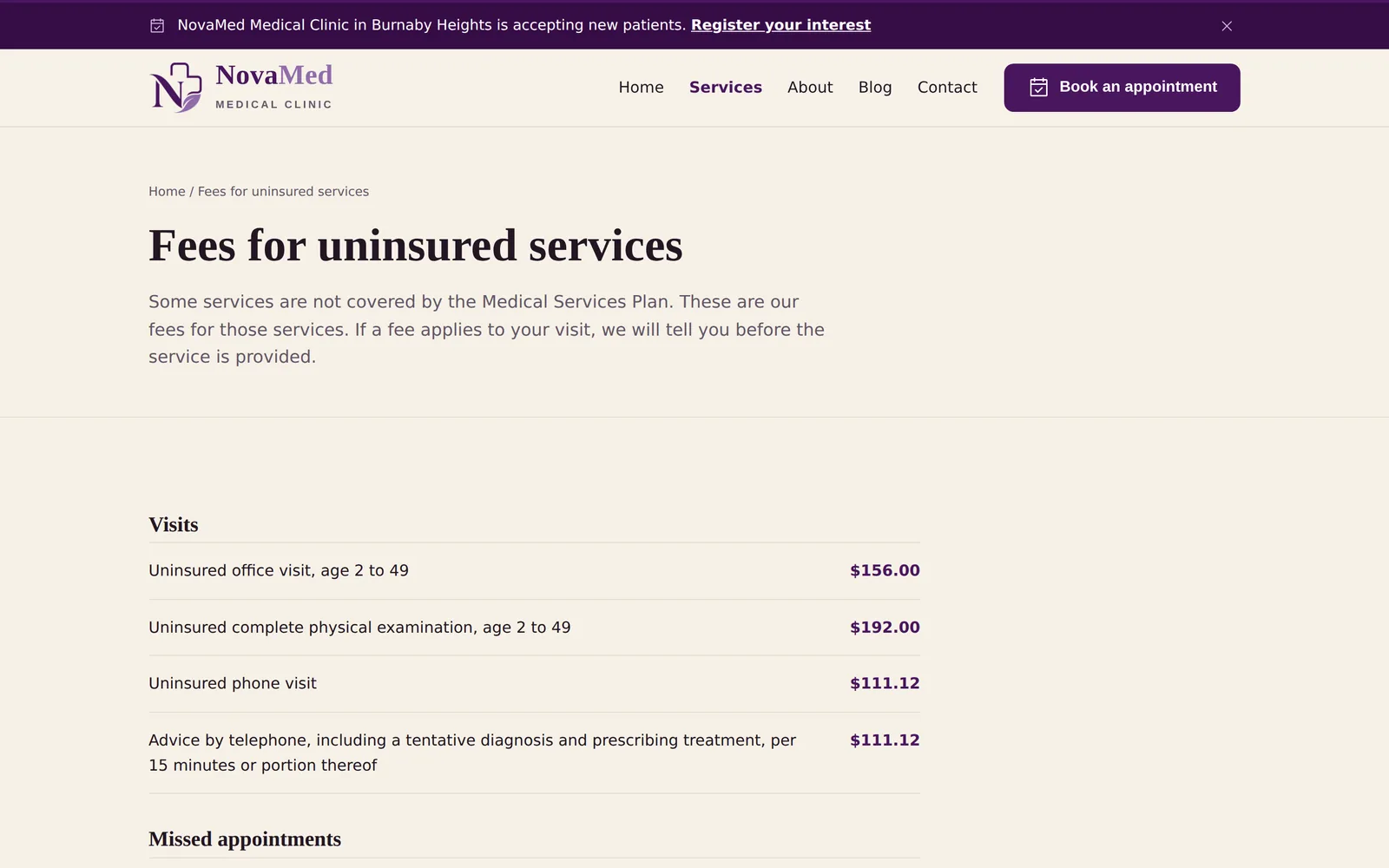
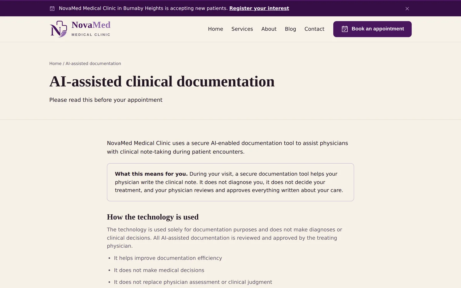
NovaMed Medical Clinic: the home page on a notebook, the family practice page on a tablet, and the phone view. The hardware is drawn in code and is an illustration; only the screens are real.
Family medicine and walk in clinic
Burnaby, British Columbia
Live
Live at novamedmedical.ca.
What the practice needed
A family practice opening at the same address as the pharmacy, under separate ownership. The site had to make the separation obvious while sharing a design language, and had to say what a visit costs when the province does not pay for it.
What was built
Twenty one pages covering each service a physician here provides, with the two things patients most often cannot find anywhere else published in full.
A published fee schedule for services that are not publicly insured, rather than a number quoted on request
A patient facing notice explaining the clinic's use of AI assisted documentation, which is unusual for a practice this size
A separate consent page for electronic communication
A service page for each line of care, from walk in to chronic disease
A cross reference to the pharmacy that keeps the two businesses visibly distinct
21 pages
149 structured data blocks across the two sites, all valid
Independent website and content audit, 9 September 2026
What was reviewed
Content reviewed on 9 September 2026 in an independent website audit against the College of Physicians and Surgeons of British Columbia Primary Care Provision standard dated 1 April 2026, current College advertising guidance, and the provincial privacy commissioner's guidance on AI scribes. The audit identified items to correct; it is not a clearance, and the legal review of the privacy and terms pages is still outstanding.
Read from the site's own stylesheet, not described from memory.
Palette
Brand#49165e
Deep#360d46
Taupe#926cab
Cream#f6f1e7
Ink#241623
Typefaces
HeadingsCormorant Garamond
BodyInter
FarsiVazirmatn
What else defines it
One design language with the pharmacy, and a lighter taupe that keeps the two businesses apart at a glance.
HomeWalk ins welcome, and a clear separation from the pharmacy next door.NovaMed Medical ClinicFeesA plain schedule for uninsured services, published rather than quoted on request.NovaMed Medical ClinicAI documentationA patient facing explanation of how notes are taken.NovaMed Medical ClinicFamily medicineOne page per line of care, with booking beside the description rather than below it.NovaMed Medical ClinicOn a phoneBuilt to be read on a phone first.NovaMed Medical Clinic
Chapter 8
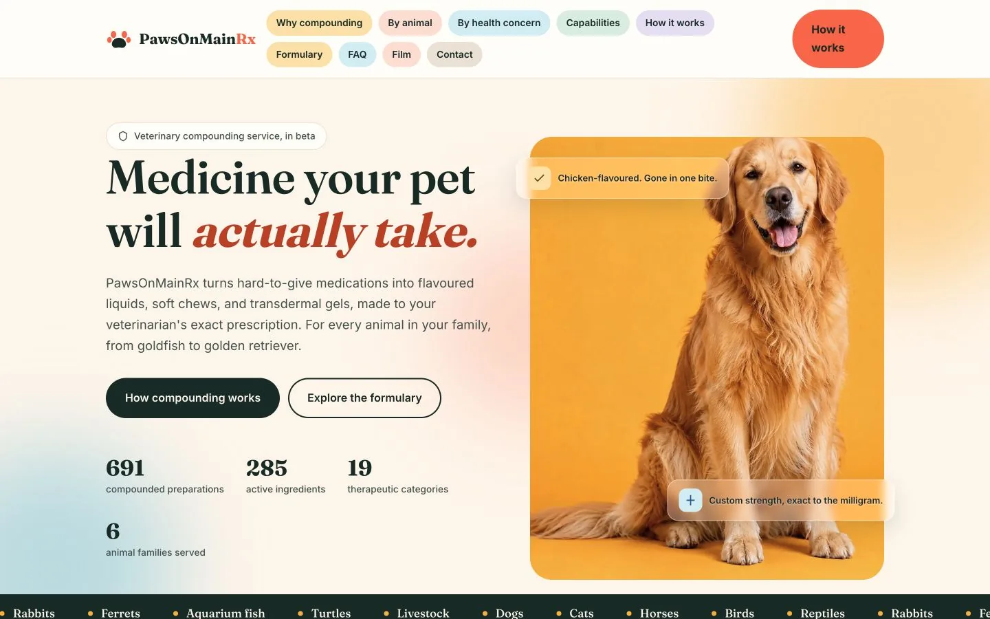
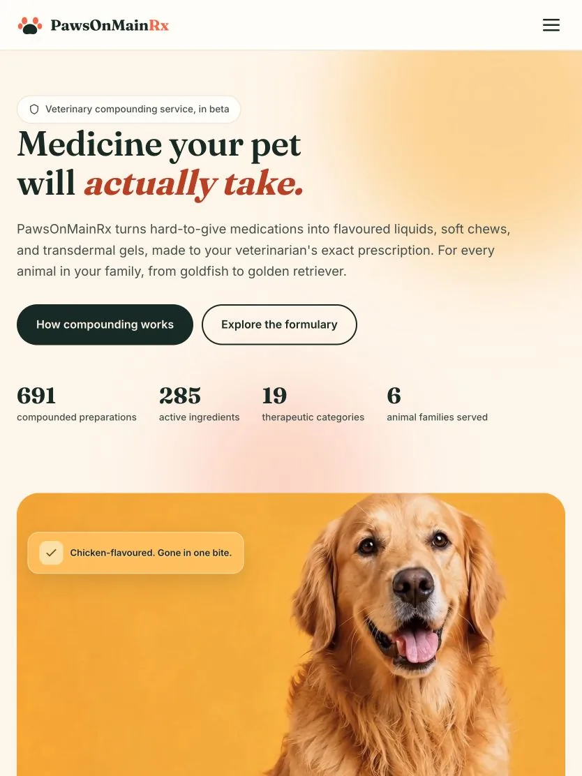
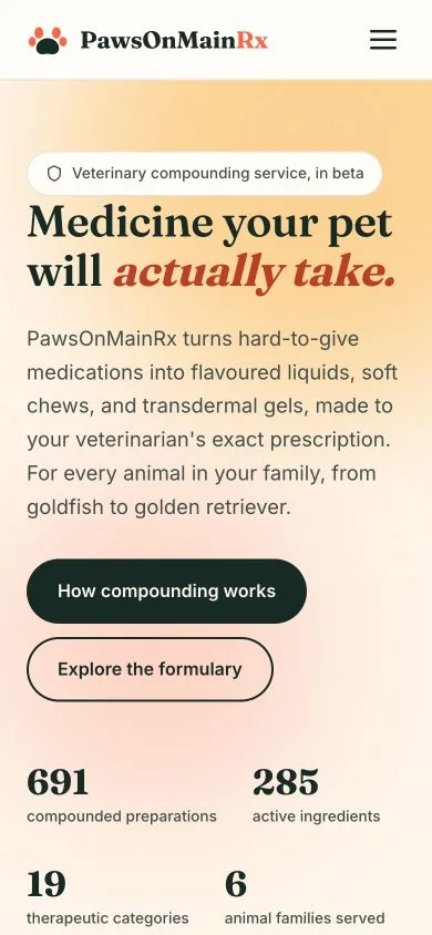
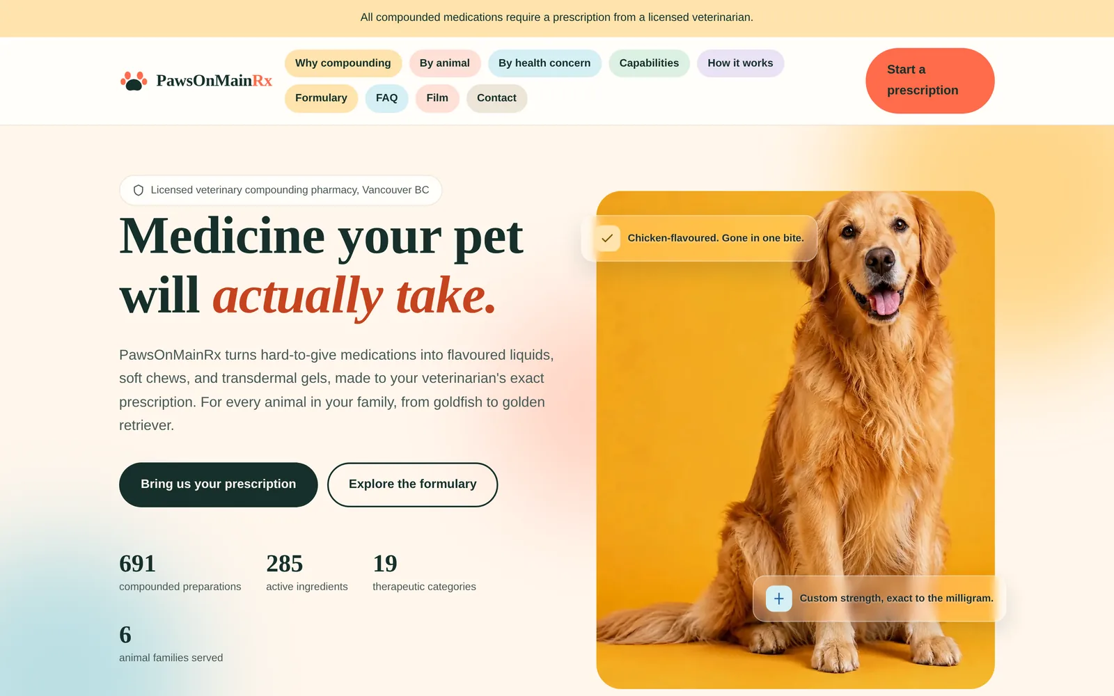
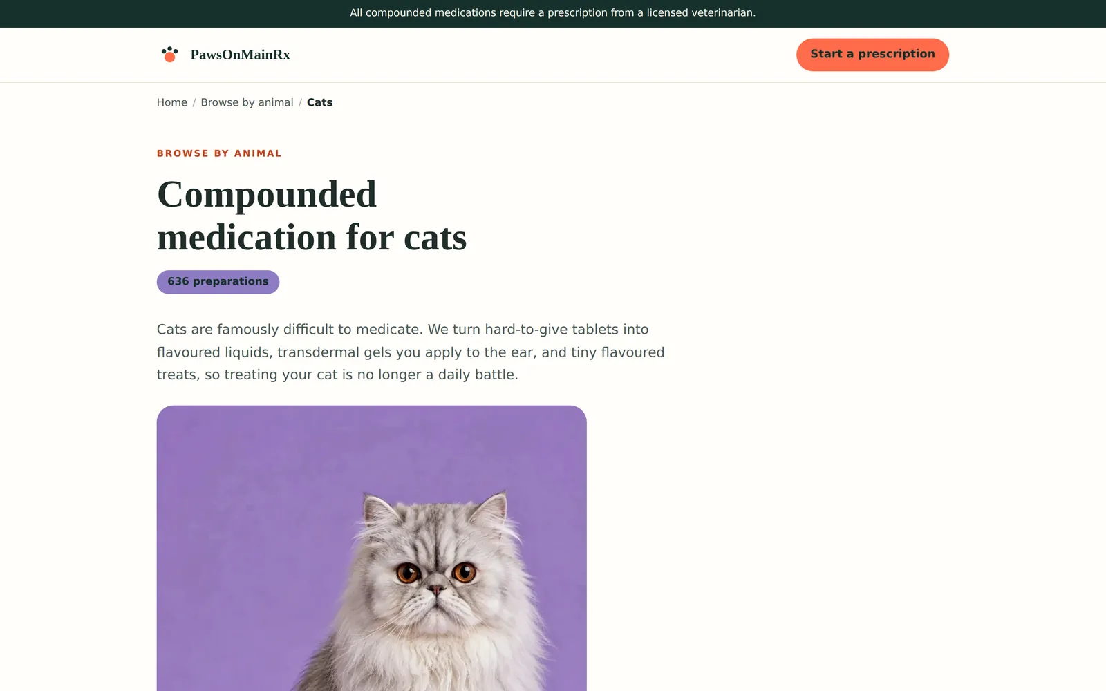
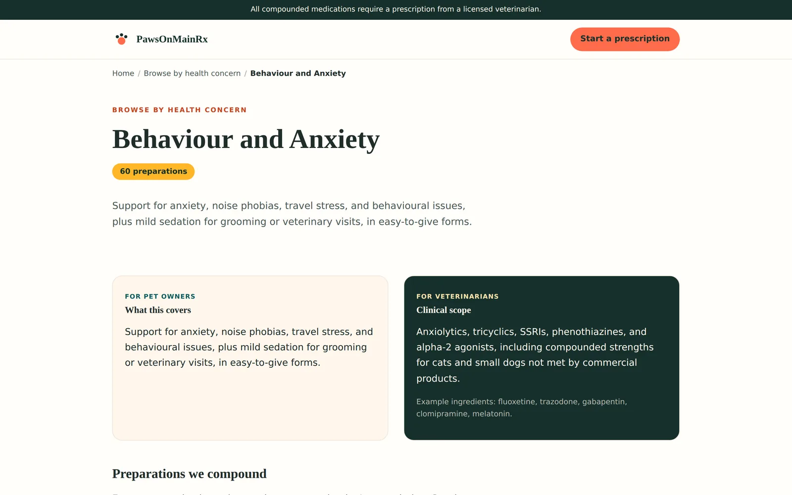
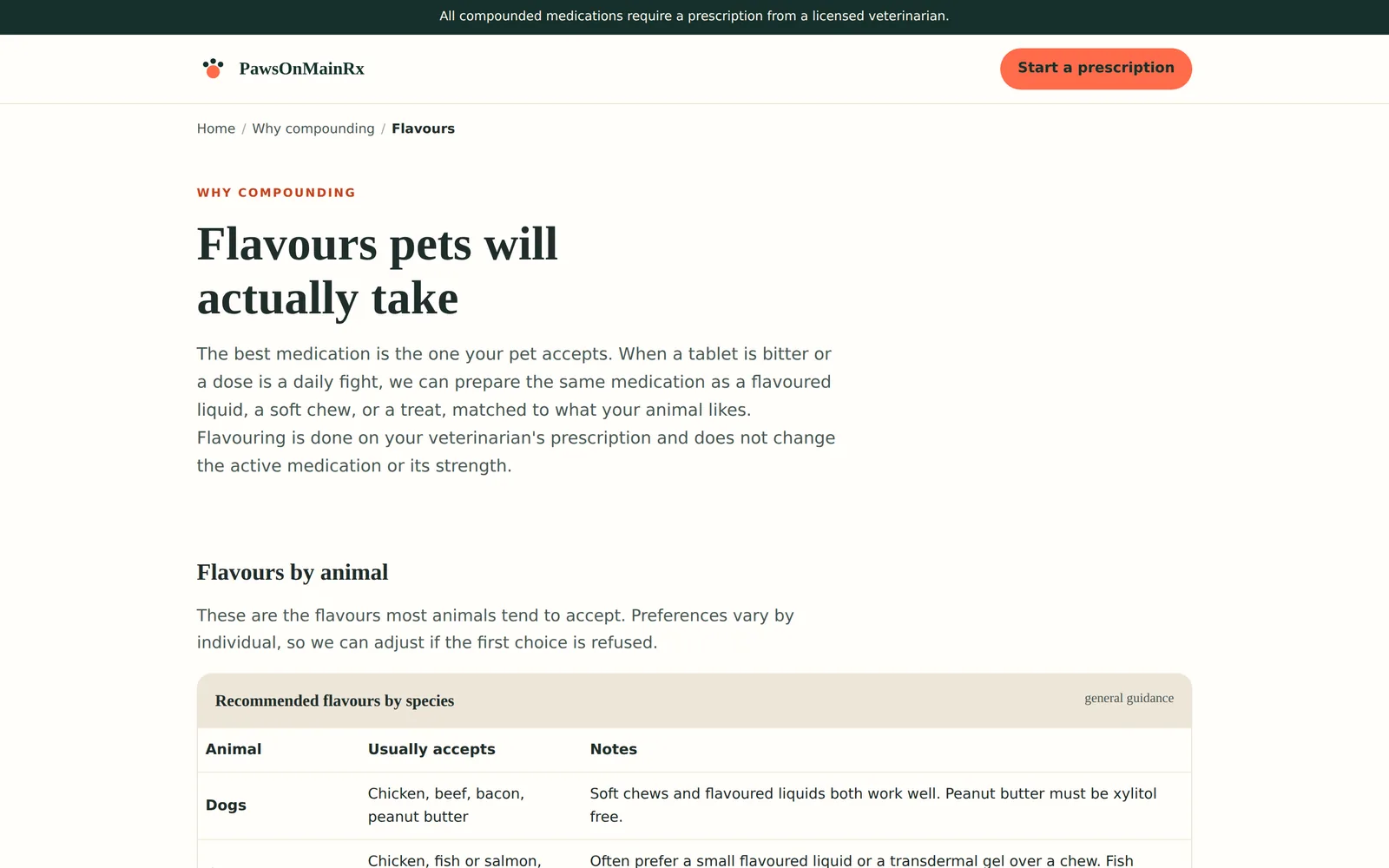
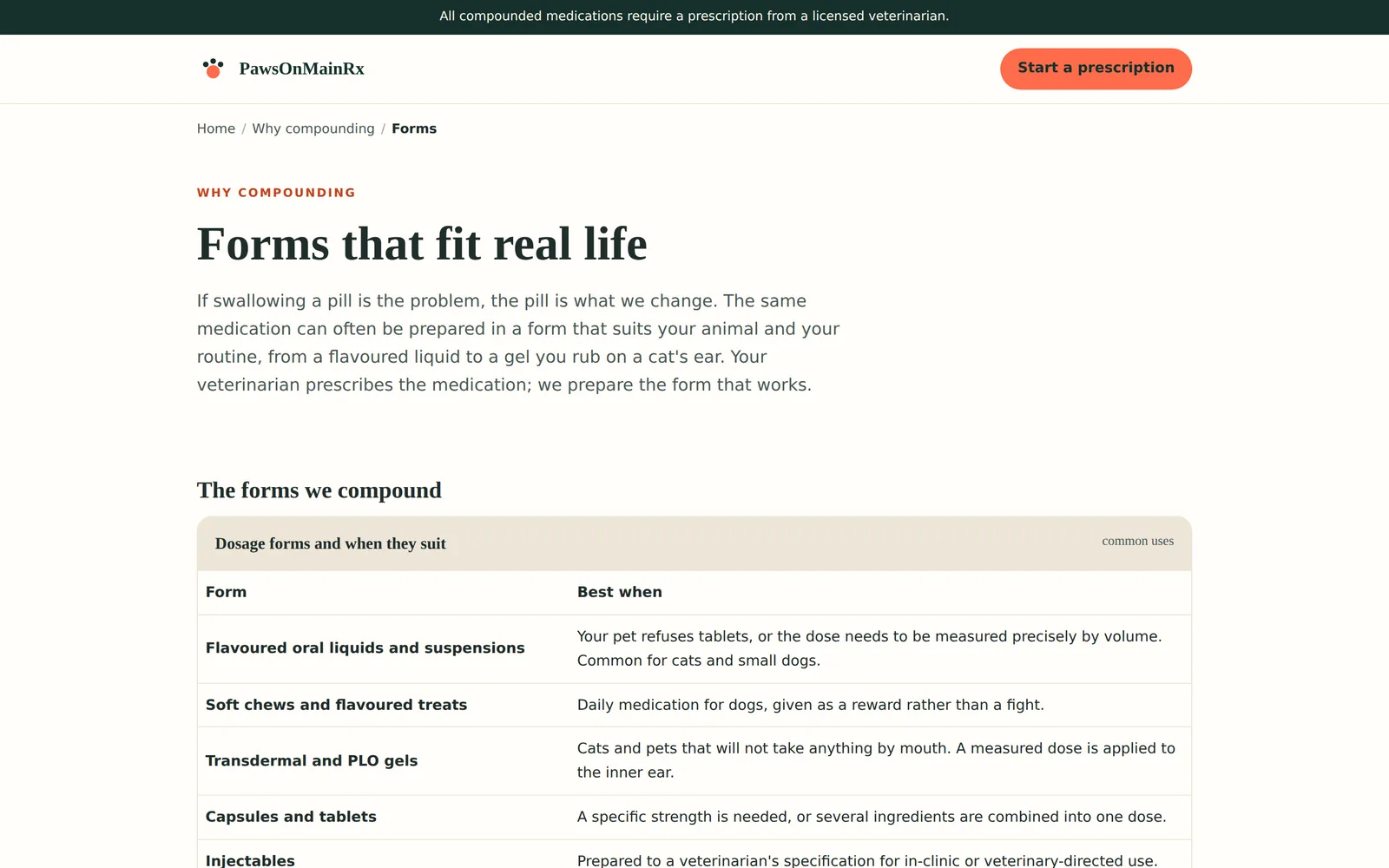
PawsOnMainRx
Desktop
Laptop
Tablet
Phone
PawsOnMainRx on a desktop, a laptop, a tablet and a phone. Real captures of pawsonmainrx.ca, 28 September 2026. The hardware is drawn in code and is an illustration; only the screens are real.
Veterinary compounding service
Vancouver, British Columbia
Live
Live at pawsonmainrx.ca.
What the practice needed
Animals refuse medication for reasons people do not: the wrong flavour, the wrong form, a dose that does not exist commercially. Owners and veterinary clinics needed to see what is possible before asking.
What was built
A catalogue of example preparations, browsable by animal and by health concern, with guidance on the forms, strengths and flavours that make a medicine acceptable to a particular species.
A single page that speaks to owners or to veterinarians, changing its language and palette at a switch
Photographs that begin to move a moment after the page settles, with a still fallback and full respect for reduced motion
Six species sections and nineteen health concerns, cross linked both ways
Flavour guidance by species, which is the question that actually decides whether a cat takes a dose
691 example preparations
285 active ingredients
19 therapeutic categories across 6 animal families
What was reviewed
Written with reference to College of Pharmacists of British Columbia expectations for a pharmacy website and to Canadian privacy law. Claims specific to a licensed practice were removed when the site was converted to a demonstration.
Read from the site's own stylesheet, not described from memory.
Palette
Coral#ff6b4a
Pine#16302b
Teal#0e7c7b
Honey#ffb627
Lilac#8e7cc3
Sky#79c7db
Typefaces
HeadingsFraunces
BodyInter
What else defines it
A three dot paw drawn inline, and a species colour that changes as you move between animals.
HomeThe retriever begins to move a few seconds in. Owner and veterinarian views switch above it.PawsOnMainRxCatsEach species gets its own hero and its own count of what is possible.PawsOnMainRxHorsesSame structure, entirely different problem.PawsOnMainRxBy concernOwner and veterinarian panels side by side.PawsOnMainRxFlavoursThe detail that decides whether the animal accepts the dose.PawsOnMainRxFormsFrom a flavoured liquid to a transdermal gel.PawsOnMainRxOn a phonePhotographs and all.PawsOnMainRx
Chapter 9
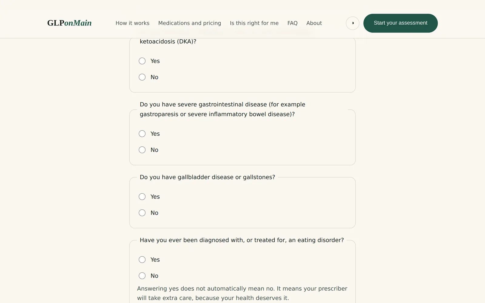
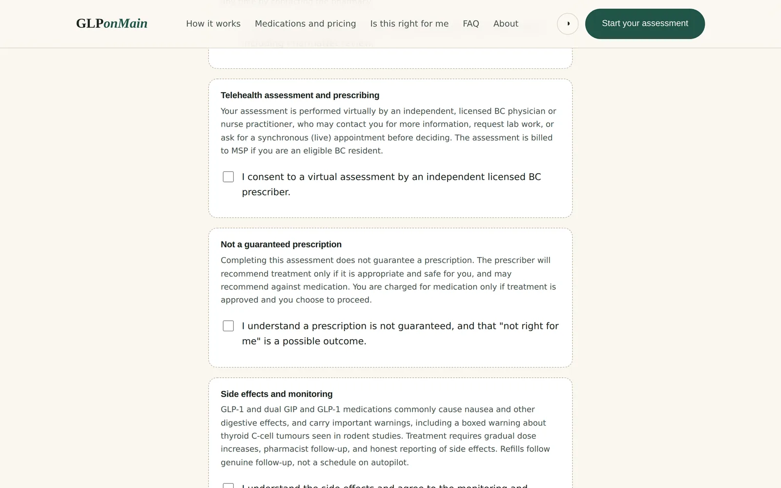
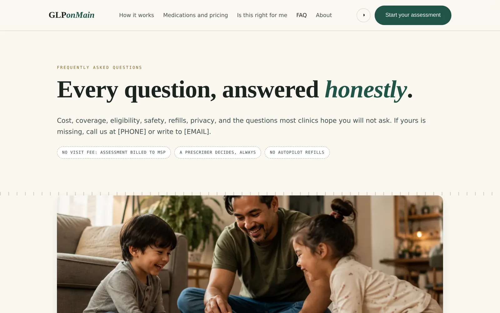
GLPonMain
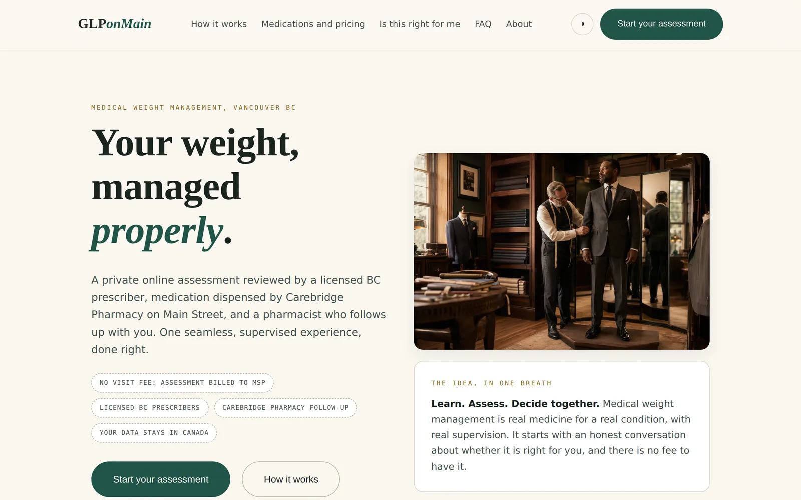
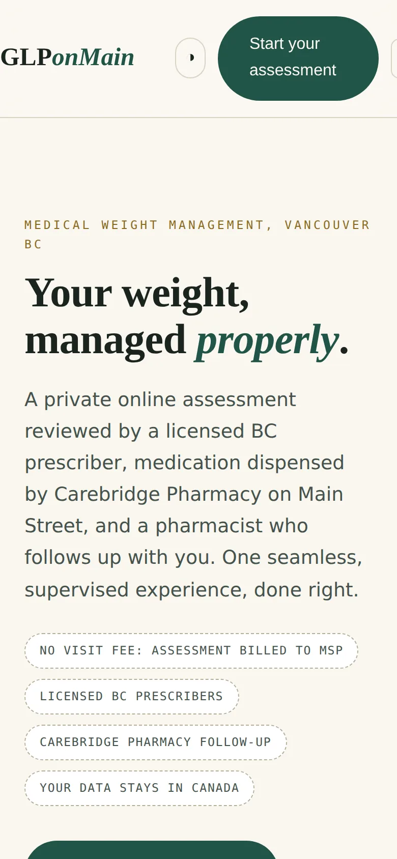
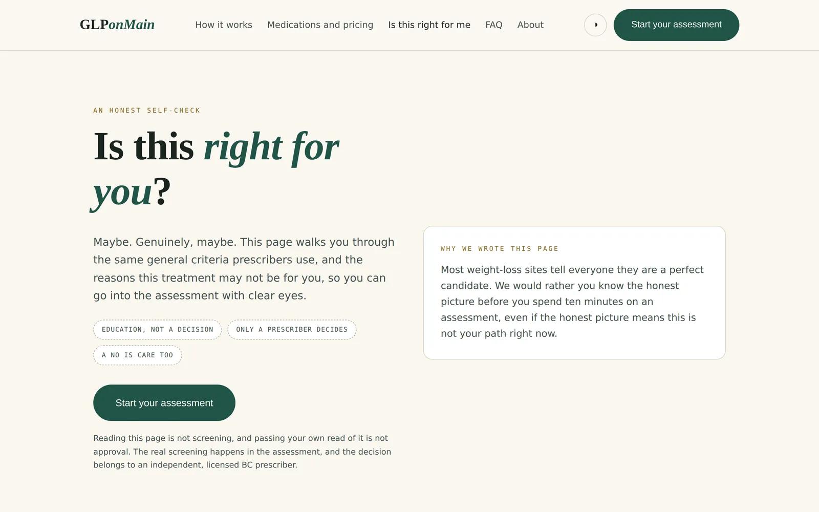
GLPonMain across the open inner display of a folding phone. The hardware is drawn in code and is an illustration; only the screens are real.
Medically supervised weight management programme
British Columbia
In preparation
What the practice needed
Weight management medication is advertised aggressively and dispensed casually. The brief was to build something that screens properly, refuses politely, and never takes money before a prescriber has agreed.
What was built
An assessment that recomputes every safety decision on the server, so a determined person cannot click past a contraindication, paired with pricing published in full.
Safety screening that ends the process, with an explanation, when an answer requires it
An explicit option to deny every screened condition, so silence is never read as a no
Consents presented as separate cards, with marketing consent visibly optional and never a condition of care
No payment taken at assessment; a card is only charged once a prescriber has approved
Answers held in the page and never written into the browser's storage
What was reviewed
Written to section C.01.044 of the Food and Drug Regulations, College advertising norms for pharmacists and physicians, provincial rules on patient choice of pharmacy, and accessibility guidelines. Internal review 7 July 2026, including a check for efficacy claims attached to any named medicine. Counsel review is the outstanding item before launch.
Read from the site's own stylesheet, not described from memory.
Palette
Pine#205448
Brass#8a6b1f
Clay#b05a36
Sage#e4ede6
Ivory#faf7f0
Ink#1b2420
Typefaces
HeadingsCormorant Garamond italic
BodyOutfit
DetailIBM Plex Mono
What else defines it
A tailor's stitch motif runs through the interface, from the hero to the rule under each heading.
HomeA bespoke tailor as the organising idea: measured, fitted, not off the shelf.GLPonMainIs this right for meA page largely devoted to reasons the answer may be no.GLPonMainSafety screeningA respectful stop, with the reason given.GLPonMainConsentFour separate care agreements, and marketing kept apart from all of them.GLPonMainQuestionsIncluding the answer that this is not covered by public insurance.GLPonMainOn a phoneThe assessment is designed for a phone in the first place.GLPonMain
Chapter 10
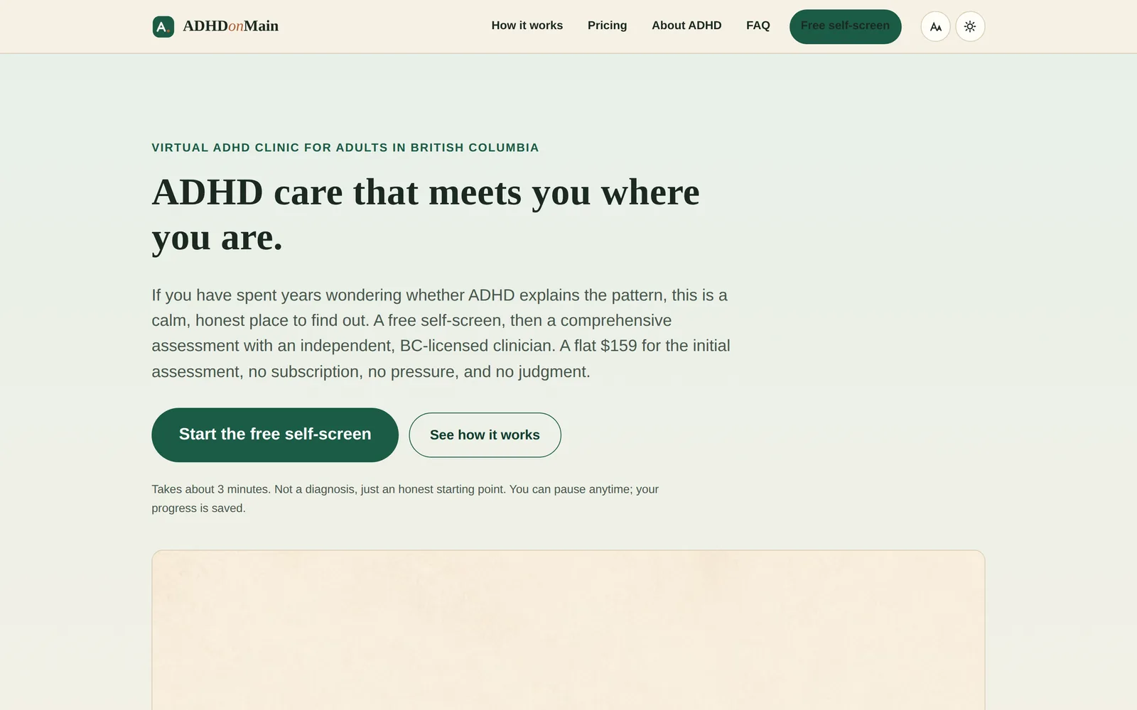
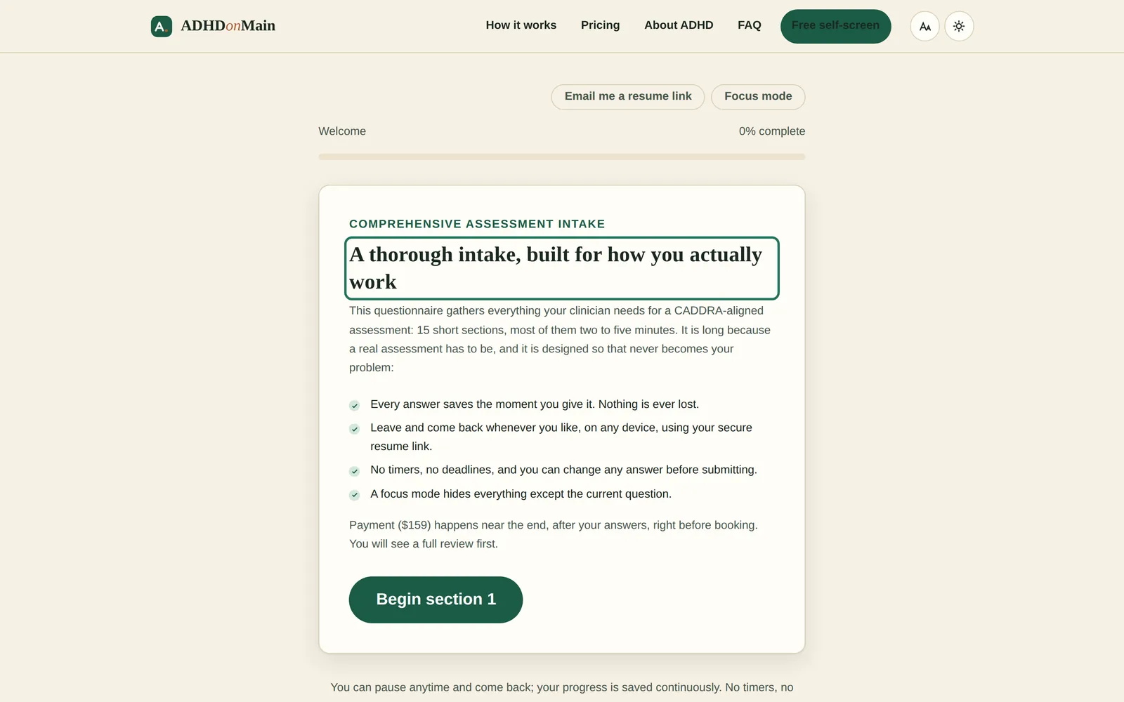
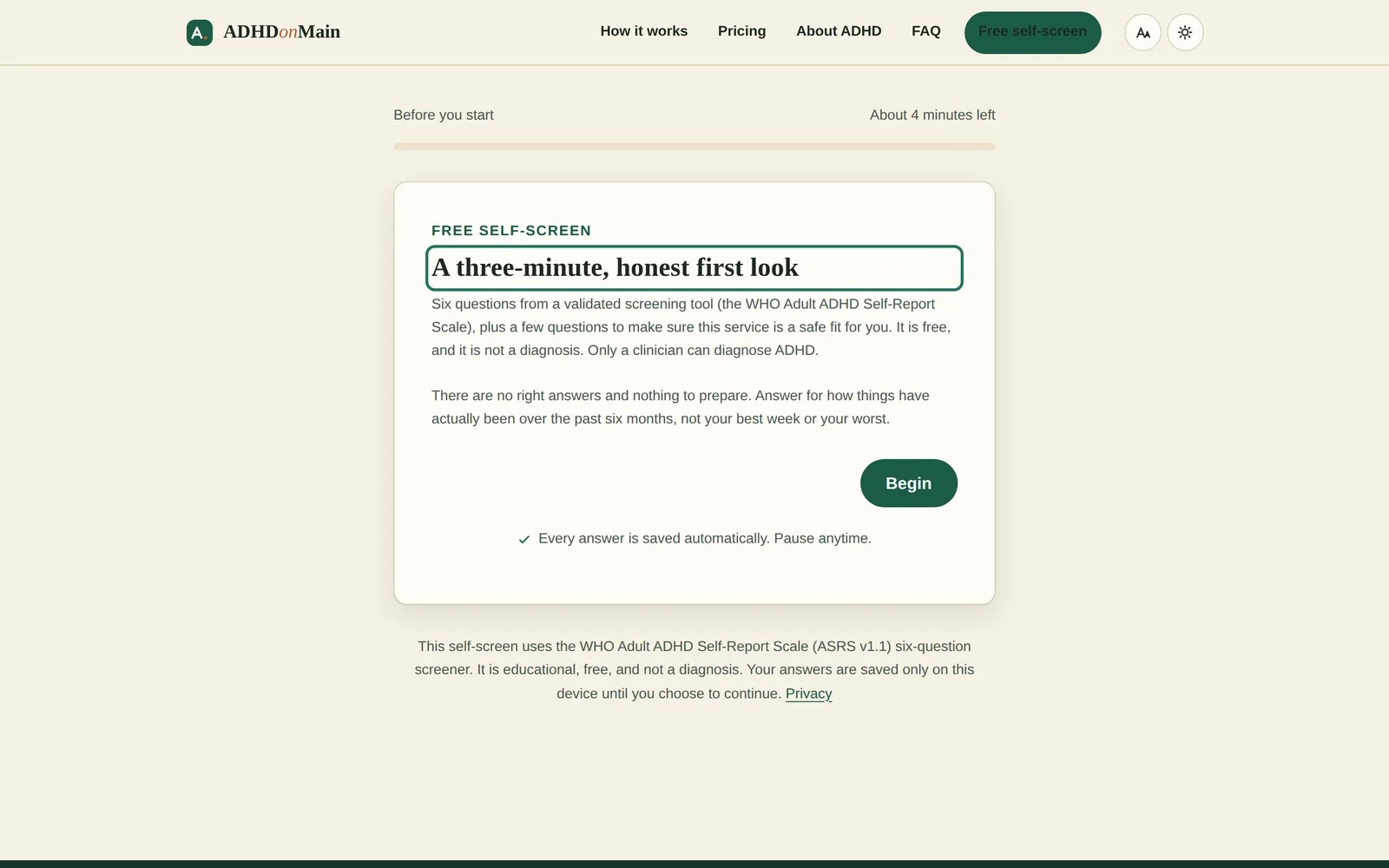
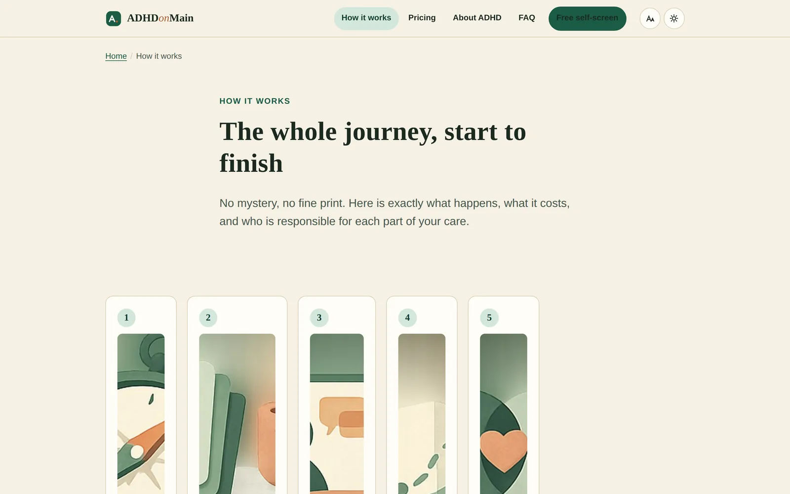
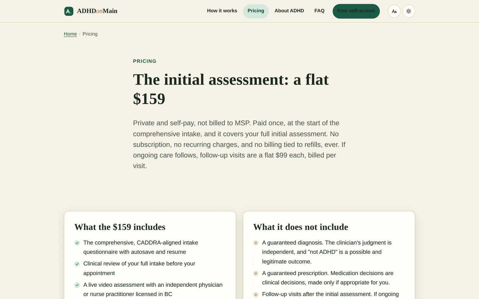
ADHD on Main
Home
Intake and screener
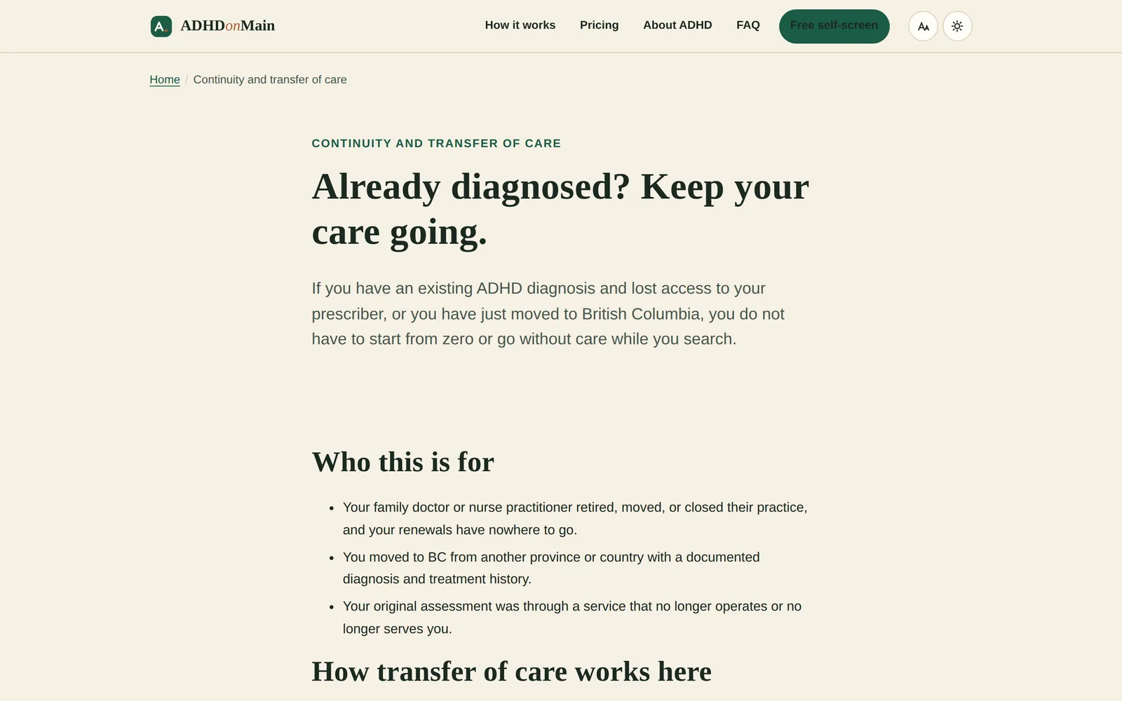
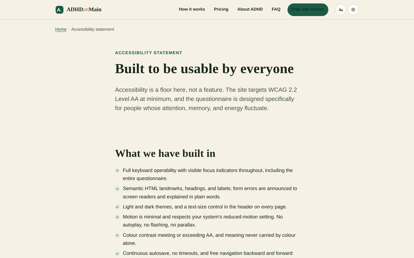
ADHD on Main: the home page on a landscape display, with the intake and screener pages on a portrait display. The hardware is drawn in code and is an illustration; only the screens are real.
Adult ADHD assessment clinic
British Columbia
In preparation
What the practice needed
The people this serves are, by definition, easily overwhelmed and likely to abandon a long form. Every decision followed from that: nothing lost, nothing rushed, nothing that reads as a test you can fail.
What was built
A free three minute self check that leads, at the person's own pace, to a fourteen section assessment which can be left and resumed without losing a word.
One question per screen, with real life examples instead of clinical phrasing
Continuous saving and no time limit, so an interrupted session costs nothing
A focus mode that hides everything except the question in front of you
Three text sizes and a light and dark setting, chosen by the reader
A clear statement beside the payment button that an assessment does not guarantee any particular outcome
What was reviewed
Written to College advertising norms for pharmacists and physicians, a recognised Canadian assessment framework, PIPEDA and BC PIPA, anti spam law for reminders, accessibility guidelines, and the restriction on advertising controlled medicines to the public, which is why medicines are discussed only by category. Review by health law counsel has not taken place.
Read from the site's own stylesheet, not described from memory.
Palette
Pine#1b5b46
Deep#123e2f
Clay#b05c33
Sage#d3e7dc
Cream#f6f0e4
Ink#1b2921
Typefaces
HeadingsIowan Old Style and the system serif stack
Bodythe system sans stack
What else defines it
A drawn hills illustration instead of a photograph, and three text sizes the reader can set.
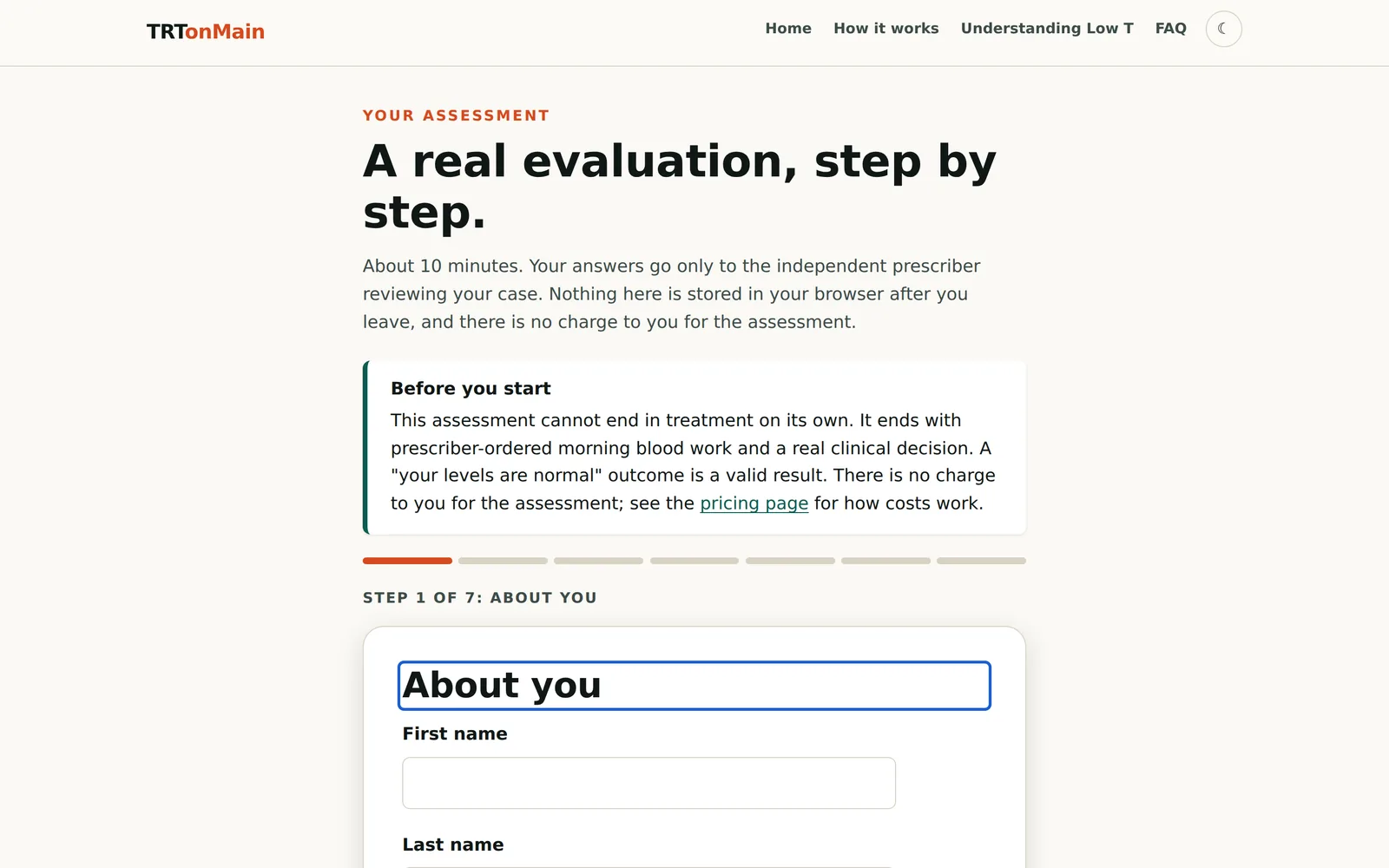
HomeCalm hills, one clear next step, nothing competing for attention.ADHD on MainFree self checkThree minutes, one question at a time, saved as you go.ADHD on MainAssessmentTime estimates per section, a progress bar, and a focus mode.ADHD on MainHow it worksFive steps, including what the pharmacist checks before anything is dispensed.ADHD on MainPricingWhat is included and what is not, side by side. No subscription.ADHD on MainContinuity of careFor people who moved province or lost a prescriber.ADHD on MainAccessibilityPublished as a statement, not an afterthought.ADHD on Main
Chapter 11
TRTonMain
At the desk
Laptop
Phone
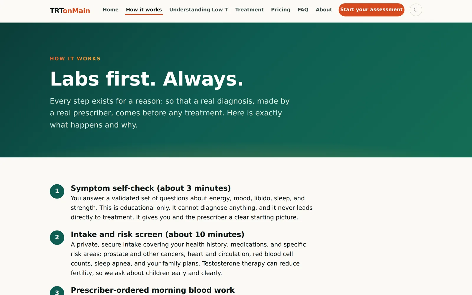
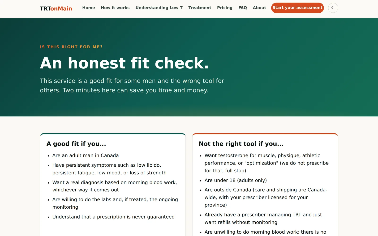
TRTonMain on a curved ultrawide display, a laptop and a phone. The hardware is drawn in code and is an illustration; only the screens are real.
Testosterone assessment and monitoring programme
Canada
In preparation
What the practice needed
This is a field full of sites that sell first and test later. The brief was to invert it: no diagnosis without blood work, no prescription promised at any point, and an honest answer when the problem turns out to be something else.
What was built
A labs first pathway, where confirmatory morning blood work is ordered and interpreted by an independent prescriber before any treatment conversation happens.
A statement in the first screen that only blood tests diagnose the condition and a prescriber decides
An assessment that stops for age, province, or a goal the programme will not serve
A gate that cannot be passed until laboratory results are on file
Six separate consents, including one about effects on fertility
Results shown with reference ranges, so a number means something
What was reviewed
Built to the advertising restrictions that apply to controlled substances, College advertising and inducement rules for pharmacists, College advertising norms for physicians, privacy law, and accessibility guidelines. Education pages reviewed by two pharmacists licensed in British Columbia, 8 July 2026. External legal review has not taken place.
Read from the site's own stylesheet, not described from memory.
Palette
Teal#0e5c52
Deep#0b3d38
Mint#4fc4a5
Ember#f05a28
Gold#f2a93b
Paper#fbf9f5
Typefaces
Body and headingsAvenir Next and the system sans stack
What else defines it
A light and a dark theme built as equals, with ambient video that stops under reduced motion.
HomeThe honesty strip sits directly under the headline, before any invitation to start.TRTonMainHow it worksFive steps, built around the rule that no labs means no diagnosis.TRTonMainUnderstanding low testosteroneEducation written to inform rather than to qualify a lead.TRTonMainIs this right for meAn honest fit check, including the cases that should go elsewhere.TRTonMainAssessmentHard stops, a risk screen, and the laboratory gate.TRTonMainPricingWhat the visit costs, stated once and plainly.TRTonMainOn a phoneThe same restraint at 390 pixels.TRTonMain
Chapter 12
PharmacyBroker.ca
The wider view
Portrait display
Phone
PharmacyBroker.ca on a curved ultrawide display, a portrait display and a phone. The phone view is a capture from 29 September 2026. The hardware is drawn in code and is an illustration; only the screens are real.
Pharmacy brokerage and valuation platform
Canada wide
Live
What the practice needed
A brokerage needed more than a listings page. Buyers wanted to search real inventory, sellers wanted a defensible number before they would talk, and both wanted to deal with someone who had stood behind a dispensary counter.
What was built
A transaction platform with a searchable directory of Canadian pharmacies, a calibrated valuation engine, and case material that explains the method rather than advertising the outcome.
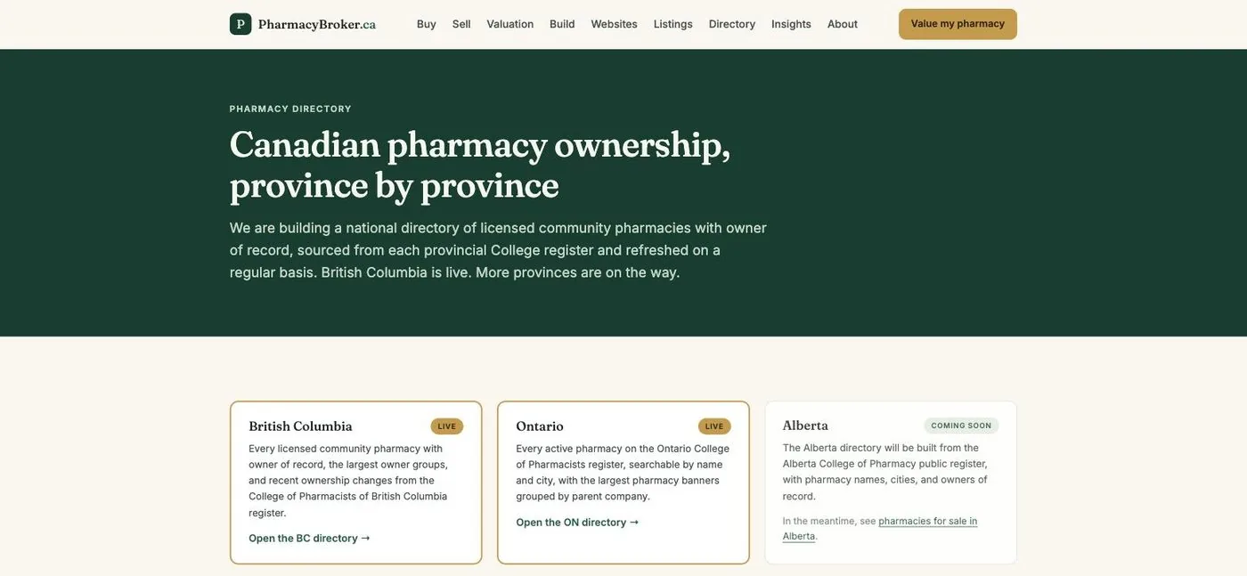
Directories covering 1,544 pharmacies in British Columbia and 5,440 in Ontario
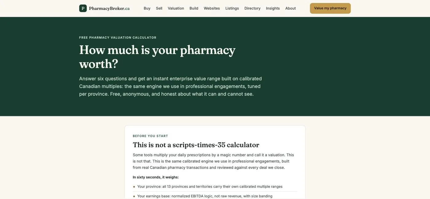
A valuation engine calibrated against completed transactions
First party enquiry tracking, so the practice knows which pages produce calls
A public interface that lets AI assistants answer questions about the catalogue
What was reviewed
Written against College advertising standards and Canadian privacy law. Confidential listing material never appears on a public page.
Read from the site's own stylesheet, not described from memory.
Palette
Pine#0e3b2e
Forest#1b5e48
Brass#c89b3c
Sage#f2f7ef
Ink#14201b
Typefaces
HeadingsFraunces
BodyInter
What else defines it
Directory and valuation screens share one card, so a listing and a number look like parts of the same instrument.
HomeThe offer in one screen: buy, sell, or build, with a broker who is a pharmacist.PharmacyBroker.caDirectoryThousands of pharmacies, searchable by province and city.PharmacyBroker.caValuationA structured estimate, with the inputs shown rather than hidden.PharmacyBroker.caOn a phoneThe same platform, laid out for one hand.PharmacyBroker.ca
How to read this
Every screen above is a photograph of the working site at the width shown, taken from the build itself. Nothing is a mockup and nothing has been retouched to look better than it is. Where a practice is not yet open, or a page is still waiting on a review, the chapter says so rather than implying otherwise.
Client names, licence numbers, addresses, telephone numbers and internal tooling are deliberately absent. A portfolio is not a reason to publish a client's operating details.